8 super-90’s design elements found on our gomen websites
- 1.1KShares
- Facebook1.0K
- LinkedIn2
Ok, ‘fess up: when was the last time you visited a gomen website and thought to yourself…
“Wow! This website is very well designed; not only is it aesthetically pleasing to the eye, but everything is laid out so neatly that I have no difficulty in looking for what I want, even if it’s from my phone.”
Yup, neither did this writer.
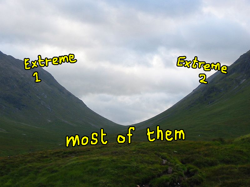
Based on our experiences, the Internet is a haven for mediocre websites. Sure, every now and then, we come across some really good ones and some really, really bad ones, but most of them lie in the valley between those two extremes.
Unedited image from sandatlas.org
Government websites and portals, no matter where in the world, are no stranger to this middle ground. In fact, they are some of the most sakit kepala-inducing group of sites from anywhere in the WWW. Generally speaking, they can be quite difficult to navigate around, and they’re not at all easy on the eyes (even if we only visit them, like, once or twice a year).
Our gomen sites, in particular, are generally okaaayish as to how they look and work. But as more and more Malaysians are getting access to the Internet, and thus getting exposed to some of the latest web design trends from around the world that emphasizes both form and function, we start to realize that our gomen may be a lil’ bit behind on the web design game.
Plus, considering the fact that our country aims to be a regional hub for digital content, having outdated sites representing Malaysia is not exactly a good thing.
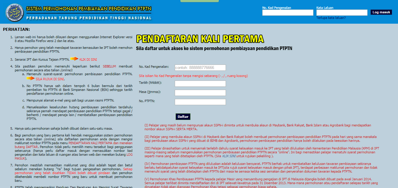
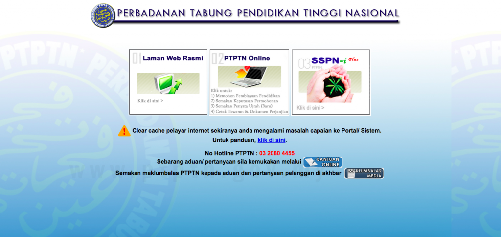
OMGWTFPTPTN pendaftaran kali pertama pun dah headache dah. Screencap from ptptn.gov.my
While we understand that design is a subjective thing, it still has its do’s and don’ts, some of which are kinda obscure to the average user. Also, this isn’t a comprehensive list as we’re sure there are more outdated design decisions that go unnoticed unless you’re a frequent visitor. Or someone who really loves gomen websites.
So, without further ado, here is a taste of some head-scratching, ketinggalan zaman elements that most of our gomen websites and portals have in common.
1. Buttons to change font sizes
You might’ve noticed these Tiga Abduls sitting at the top of most pages on gomen sites:
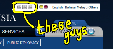
The font size buttons we’ve come to take for granted. Screencapped from kln.gov.my
Most of us would raise an eyebrow at the sight of those cute lil’ buttons. Why would they include such an outdated feature on the site? Since the browsers of today come with built-in zooming functionality, there seems to be no reason why anyone would want to use them.
Well, it turns out that these buttons are actually a compulsory part of the Web Accessibility Initiative by the World Wide Web Consortium (W3C). What this means is that they are crucial in making the Web more accessible to users with disabilities, specifically those with visual impairment.
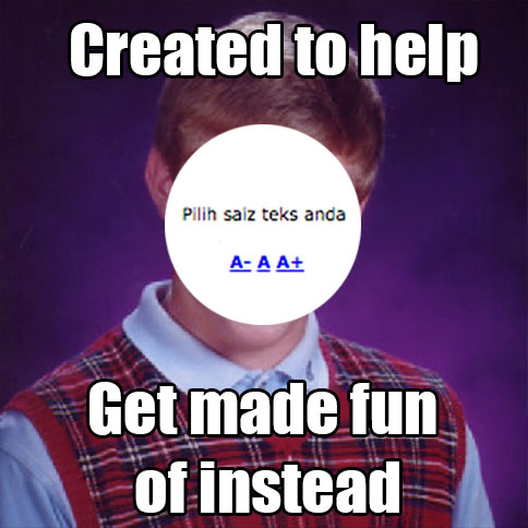
Being gomen sites, they have to cater to the public, and this feature allows them to reach out to Malaysians with poor eyesight (or those who simply like to see big things, like ex-intern Letitia who makes everything 323496x bigger for who knows what). Some sites even include a reader that reads text out loud.
2. White space (or the lack of it, rather)
FYI – white space refers to the empty space between text, images, etc. on a site. And no, it doesn’t necessarily have to be white.
The homepages of most gomen sites tend to have an overwhelming amount of information crammed into almost every screen estate available on the page, sparing very little white space.
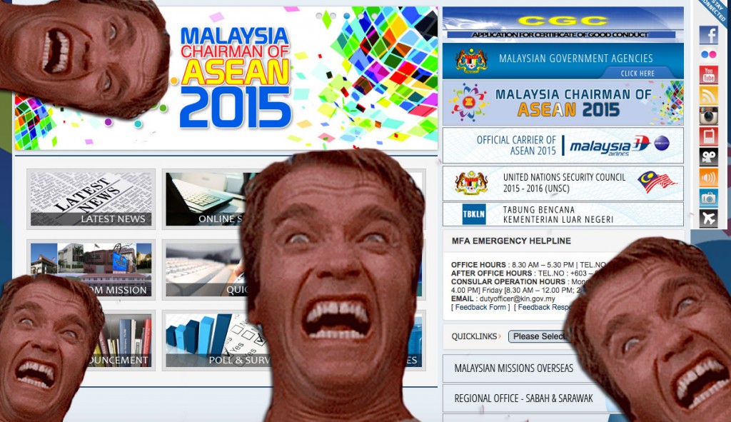
Even Terminator gets Terminated. Screencap from Ministry of Foreign Affairs.
Visitors might be getting their minds blown by the sheer amount of text, images, icons and links that greet them that it becomes somewhat of a small headache for the average user to navigate. Most of the time, we would end up using the search function to actually get to what we want… if we can even find the search box, that is.
There are some that see white space as wasted space, when it is there to not only make information more easily accessible, but also easily digestible.
So, it is curious to see how white spaces are underutilized on our gomen sites considering they are there to provide information to the public. Having to navigate a maze-of-a-site is no better than having to wait for your turn at a gomen service counter.
Yup. Thanks, white space! Image from medesignlab.com
3. Arial and other terrible, horrible, no good, very bad font choices
Ok la, that may be a bit of an exaggeration, but you cannot deny the importance of choosing the right font (or, more accurately, web font) when it comes to designing a website.
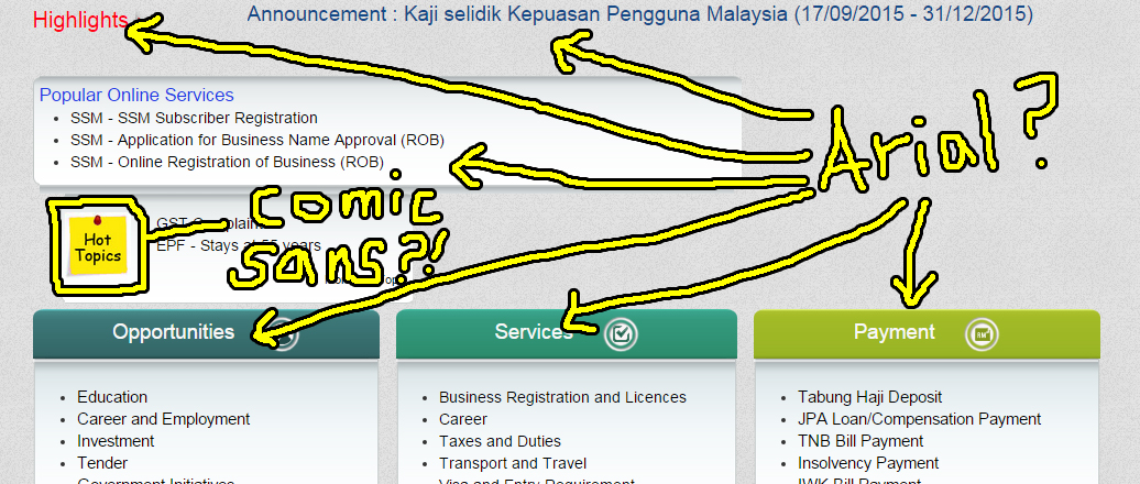
Are… are those… Arial? And is that frikkin’ Comic Sans on the Post-It note?! Screencap from malaysia.gov.my
A good font needs to be legible or readable, and it needs to blend in nicely with the overall design without sticking out like a sore thumb. Sure, any of the so-called “default fonts” like Arial or Times New Roman can easily do both, but they don’t exactly make a website look good.
Considering the countless fonts the Internet has dumped on us over the decades, and how good they have become, there shouldn’t be a reason why anyone would want use those fonts, anyway… unless of course, the web designer is just lazy.

OR… the designer is a hipster. Meme from quickmeme.com
Now, fortunately, most gomen sites have looong moved away from default fonts. It makes sense, too, since better looking alternatives can easily be found, ready for web design use, through free services such as Google Fonts, or through subscription-type services like Adobe Typekit.
But perhaps why we are still seeing Arial and gang on some of the gomen sites is due to the fact that the more attractive web fonts affect loading time. Also, not everyone with access to the Internet is running the latest browser, which means the user would not even see the web fonts due to compatibility issues.
4. “Best viewed at a resolution of 1024 by 768 pixels”
When I think of 1024 by 768 pixels, I’m reminded of this view of my dad’s desktop from when I was a kid.
Not my dad’s desktop, but close. Image from winsupersite.com
The golden resolution of 1024 by 768 pixels is as familiar to us as does Windows XP. Five years ago, 20% of web users had this resolution set on their computers, and that number has since dwindled down to a mere 4% today.
In other words, as we move on to the realm of HD displays – heck, we now even have 4K displays on smartphones, ugaiz – websites are definitely no longer “best viewed at a resolution of 1024 by 768 pixels”.
Given that most of us surf from our smart phones and tablets, and given that the minimum resolution of current computer displays are higher than 1024 by 768, this “recommendation” is obviously outdated. What’s curious-er is that most of the gomen sites are already designed with responsive viewing in mind, as well, which means that the recommended viewing option should be updated to the currently higher display resolution, if not scrapped off entirely.
Responsive mobile design in action. Image from ProBE 2014 Report. Click for full report.
(However, this writer is of the opinion that a recommended browser should still be listed. Apparently, Opera is very stubborn when it comes to saving article drafts, even after repeated refreshes. Bummer.)
5. Animations from the Geocities-era
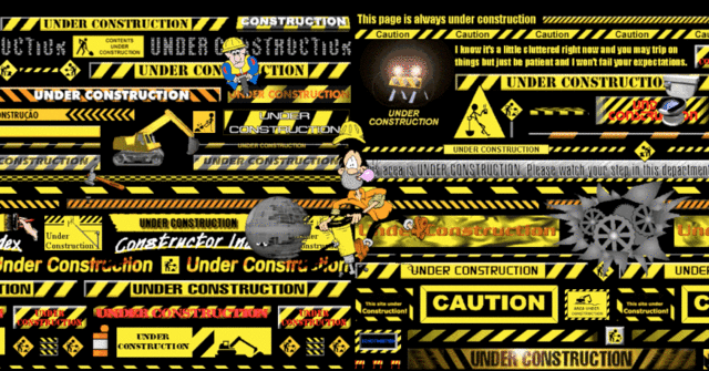
UNLEASH THE FURRRRYYYYYYYY! Gif from fastcodesign.com
Once upon a time, animated gifs were all the rage (they still are, but nowadays, they are much more refined). Along the way, that gave way to Flash animated intros that play at the beginning of most sites back in the day. These days, animations on sites are simpler, and much more subtle.
Having animations on a website is not a bad thing… or so we thought. Basically, animations are used to draw a visitor’s attention to something like, say, a fresh news entry, but they can get pretty annoying especially if it is constantly winking at you out of the corner of your eye.
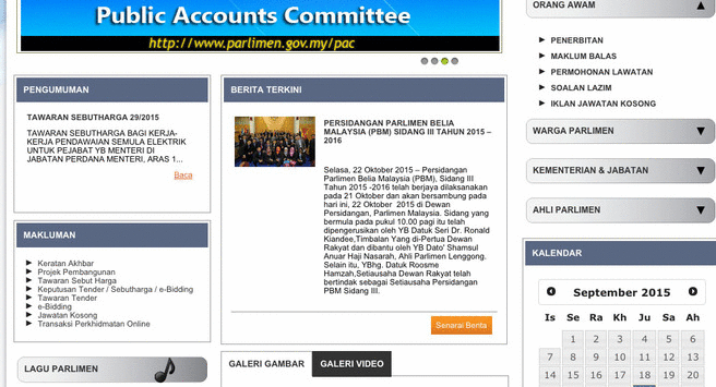
Stahp. Epilepsy. STAPH. From parlimen.gov.my
Most of our gomen sites have fortunately stopped using those tacky gifs, and has since moved on to more purposeful forms of animations, like the slide show CILISOS has on the main page. So it is curious to see that some gomen sites, like the Parlimen’s, still uses such old-school animations. Maybe its the nostalgia.
6. BLUE, BLUE, EVERYWHERE ALSO BLUE

Sorry, wrong Blue… Photo from thesun.co.uk
Ok ok, to be fair, this one isn’t something from the 90s… But it’s re-angled our story slightly and felt that this point is still interesting, so we decided to just leave it here. #donthatecilisos
Anyway, the prominent usage of a particular colour in website design has many purposes. While the colour white is commonly used with black text to provide contrast and improve readability, other colours are used to compliment or add vibrancy to a website. These vibrancy colours are chosen to evoke a specific mood in the visitors. Red for excitement and importance; green for growth and stability, and yellow for happiness and optimism.

So colorful, much positive meaning. Image from fastcompany.com
We’re guessing ugaiz can already figure out the colour of choice for most of our gomen sites.
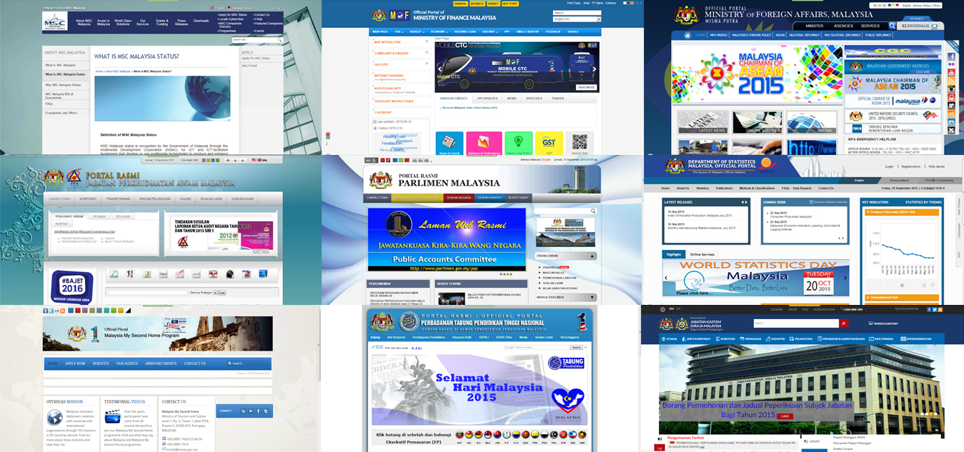
10 points to Ravenclaw. Screencapped from mscmalaysia.my, treasury.gov.my, kln.gov.my, jpa.gov.my, parlimen.gov.my, statistics.gov.my, mm2h.gov.my, ptptn.gov.my, customs.gov.my
Yup, the colour blue is very prominent across our gomen sites. Supposedly, the colour promotes the idea of safety, openness and reliability, but given the state of things recently, err… we’re not so sure about that.
Well, the easy way would have been to say that it’s because blue is the colour of Barisan Nasional. While that may most likely be the case to streamline the gomen’s corporate identity, the color blue may have been chosen because of the supposed qualities it possessed. What government wouldn’t want to portray themselves as dependable and transparent, right? RIGHT?
But since blue isn’t the only color that has a positive meaning, it’s curious that gomen sites don’t feature more of such un-blue colors.
It’s interesting to note, though, that the portal for the PMO uses the colour purple.

Which coincidentally promotes the idea of luxury and mystery (ahem). Screencapped from pmo.gov.my
7. Just entirely looking like….. this.
WHAT.
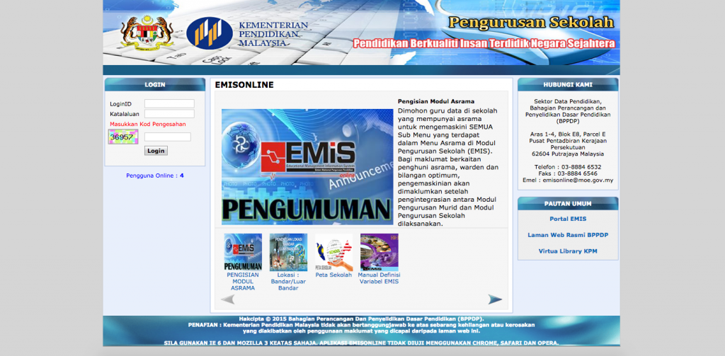
STAHP.
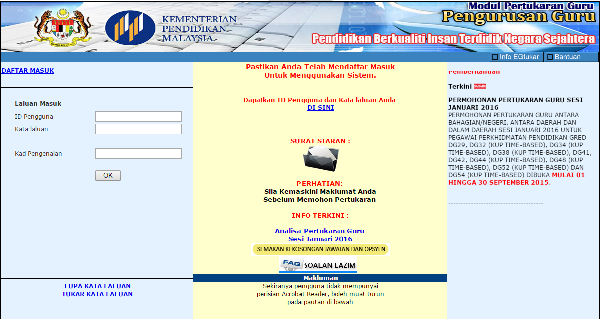
NO NO NO.
Y U NO take advantage of CSS?! (Thanks to commenter Muhammad Fikhri for letting us know about these MOE sites!)
Ok, this might get a little technical, but bear with me. First of all, websites are designed using a little something called the Hyper Text Markup Language, or HTML, which utilizes tags to define the content of a website, such as headings and paragraphs. What HTML wasn’t designed to do was stylize the content.
So, the W3C (yes, the same one from point #2) created the CSS (or Cascading Style Sheets) which basically opened up many possibilities of how websites can be designed. Web designers could play around with CSS and add better web fonts, include gila cun animations, and so much more.
We suspect the reason for their existence are similar to that of point #3, where browser compatibility is an issue, although browsers that do support CSS allows for the site to be consistently presented. Another reason may be that, because CSS is essentially extra code in a website, it may have been more practical to only use them on the more prominent gomen sites that has a qualified web team, and not use them for the more niche sites and portals.
8. Those number-ful hit counters
The 90s was a historical period in the development of the Internet, and because it was still growing at the time, webmasters did not have the in-depth analytic tools that we use today to track websites’ performance.
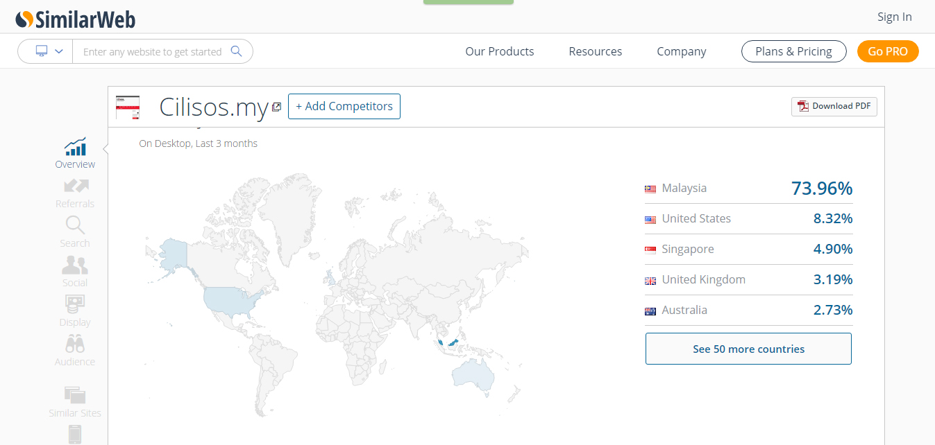
SimilarWeb is one such example of a modern-day web analytics tool. Oh… AND THANKS, UGAIZ. Screencap from similarweb.com
It’s not that webmasters back then did not care about how well their websites were doing, but most methods of measuring site traffic were just crazy expensive or complicated. Plus, the early days of the Internet were mostly made up of simple (but unattractive) websites, and not everyone had access to it, anyways.
But because so few people were on the Internet back then, those webmasters were curious about one thing: how many of you nerdy fellas are looking at my website?
That’s where the hit counter comes in.
Gotta use ’em all! Image from priceonomics.com
Also called web counters or visitor counters, they literally count the total number of hits or visitors a website has received. Of course, over the years, it grew into a bragging rights of sorts, kinda like how some of us brag about the number of followers or likes we have. Some things never change, ey?
Apparently, some gomen sites also refuse to change by still incorporating these outdated hit counters into their web design.

Screencaps from kln.gov.my, parlimen.gov.my, treasury.gov.my, pmo.gov.my, statistics.gov.my
Seriously, get rid of them.
.
.
.
So, while these curious design decisions are not necessarily bad decisions on their own, they do contribute to the overall user experience of gomen sites. Which brings us to the question…
Why do gomen sites generally have such outdatedly ‘meh’ designs?
Like we mentioned just now, websites are actually designed to meet certain standards, with the standards set by the W3C being the most common.
While more and more websites are loosely following the standards in favour of creative expression and experimentation, government sites are required to meet the universal standard, as well as the standard set by, well, the government themselves.
For our gomen sites, the Multimedia Development Corporation (MDeC) has an annual assessment called the Provider-based Evaluation (ProBE) that makes sure that gomen sites – all 1,086 of them, which admittedly is far beyond the scope of this article – are providing better services to the rakyat with every assessment. These were introduced as a progression of the Malaysia Government Portals and Websites Assessment (MGPWA) that was held from 2005 to 2013.
Unedited image from bigbangtheory.wikia.org
The self-assessment system is supposedly based on a set of criteria that itself is based on the global standard for government sites, covering aspects such as:
- site performance
- functionality
- content
- navigation
- search
- online transparency, and
- look and feel.
While some of the things featured in this article, such as #2 and #5, have been an ongoing development amongst governmental sites to increase functionality, the look and feel aspect of government website design are relatively new. In fact, as recent as the 2013 MGPWA, design aesthetics were never considered.
In other words, as gomen agencies continue to push the practicality of their site designs and improve usability, they never really bothered with improving the actual look of the sites up until last year. Maaaybe this is why we still see the five outdated design elements we mentioned above.
One of our readers, Daniel Chong, pointed out that this seems to also be the case with Opposition-owned gomen sites, as well.

Click to view original comment on Facebook.
Indeed, the Selangor state gomen site has almost all of the outdated design elements we’ve listed in this article.
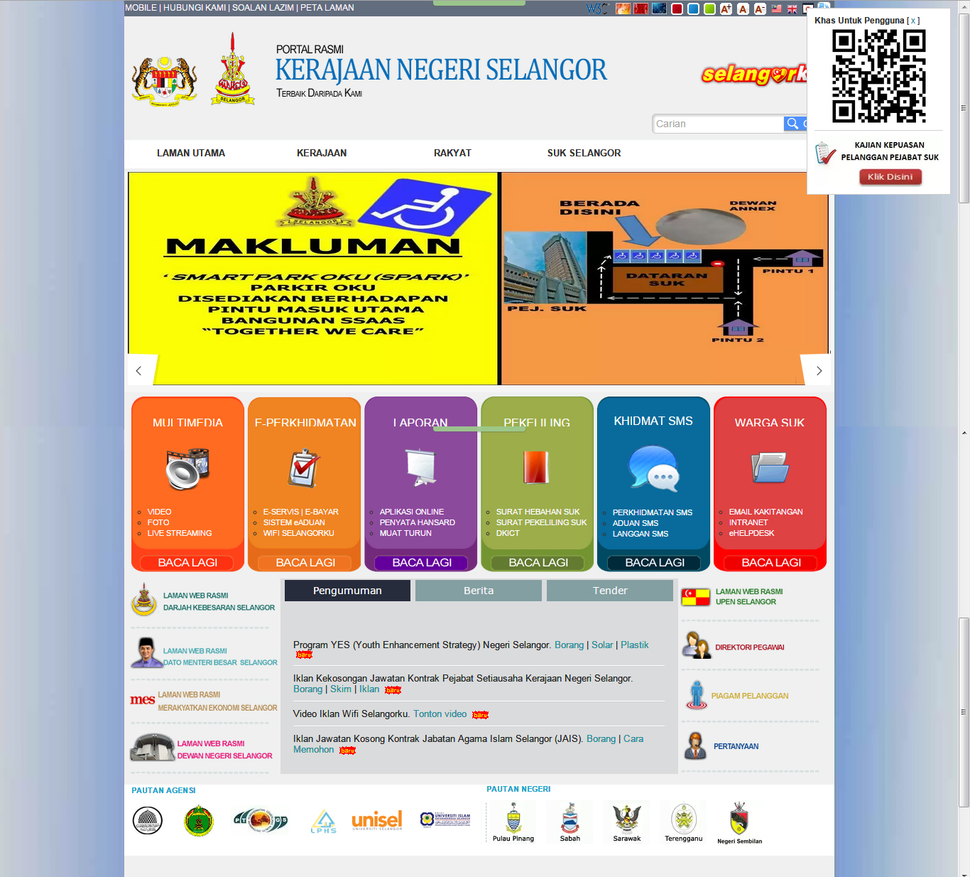
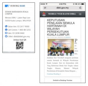
We’re guessing that the QR code is there to make the site appear more current, but even that is already outdated. Screencap from selangor.gov.my
But there are those that don’t make us wanna cry
Having nitpicked through some curious design decisions and receiving opinions from an industry player, it’ll be amiss to not share some of the gomen sites that are indeed up-to-date in their designs, in both usability and appearance.
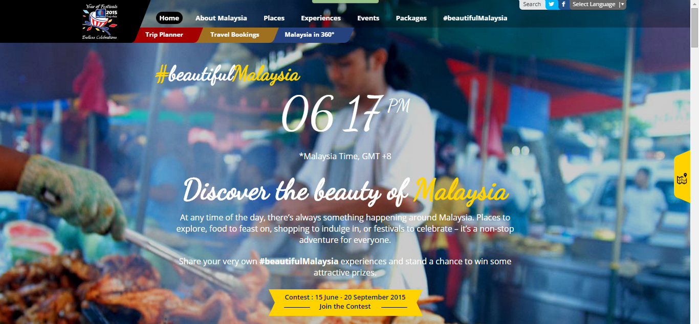
A font that ISN’T Times New Roman or Arial? WE ARE NOT WORTHY. Screencapped from tourism.gov.my

OMG COMICS?! Screencapped from gst.customs.gov.my
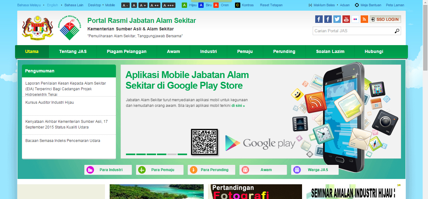
A site that’s as clean as the Jabatan they’re from. Screencapped from doe.gov.my
There are quite a few, aren’t there? It does make you wanna go “There, got what! Who says gomen sites are ketinggalan zaman?!” Maybe. Some quarters actually have the budget to engage with private agencies to create a beautiful, swanky new site. Some don’t.
The fact of the matter is, this is just the tip of the digital iceberg. There are still plenty of gomen sites that could use the improved design. Perhaps, with all of the improvements that will be put in place as a result of meeting standards and scoring assessments, combined with an increased awareness for good web design, it will lead to better-looking and better-performing government sites.
If you’ve noticed other outdated design elements, or if there’s a particular gomen site that you love, tell us in the comment section below! 🙂
- 1.1KShares
- Facebook1.0K
- LinkedIn2


7 Comments