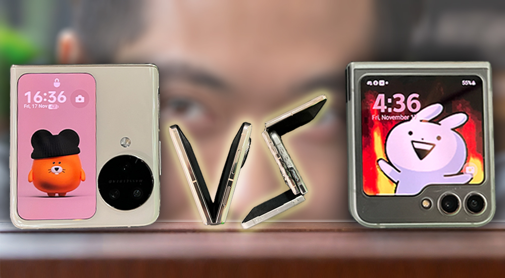
No specs, no benchmarks. A daily use review of the Oppo Find N3 Flip vs Samsung Z Flip 5
- 190Shares
- Facebook148
- Twitter7
- LinkedIn10
- Email10
- WhatsApp15
When Oppo asked if they could send me a review unit of the Oppo Find N3 Flip, I jumped at the Oppo-tunity. Since I just bought a Z Flip 5, I needed validation that I made the right choice.
Before we talk about the differences, lets first talk about the kind of user these phones are meant for. From using a flip phone since 2021 with the Z Flip 3 and meeting other owners, I can say that you’re likely someone who:
- Sees a phone as an extension of your personality rather than a practical device
- Someone who’s willing to put up with inconveniences just to have something special
- Is totally okay with admitting that you’re a sucker for gimmicks
- Secretly gives your phone nicknames
This is because, when you buy a flip phone, you’re not buying the best flagship in the market – you’re buying a phone that makes you feel special. You’re buying a phone that people associate with you. You’re buying into a conflicting feeling of pride and anxiety when someone asks to look at your phone and secretly praying they won’t try to swing it open one-handed.
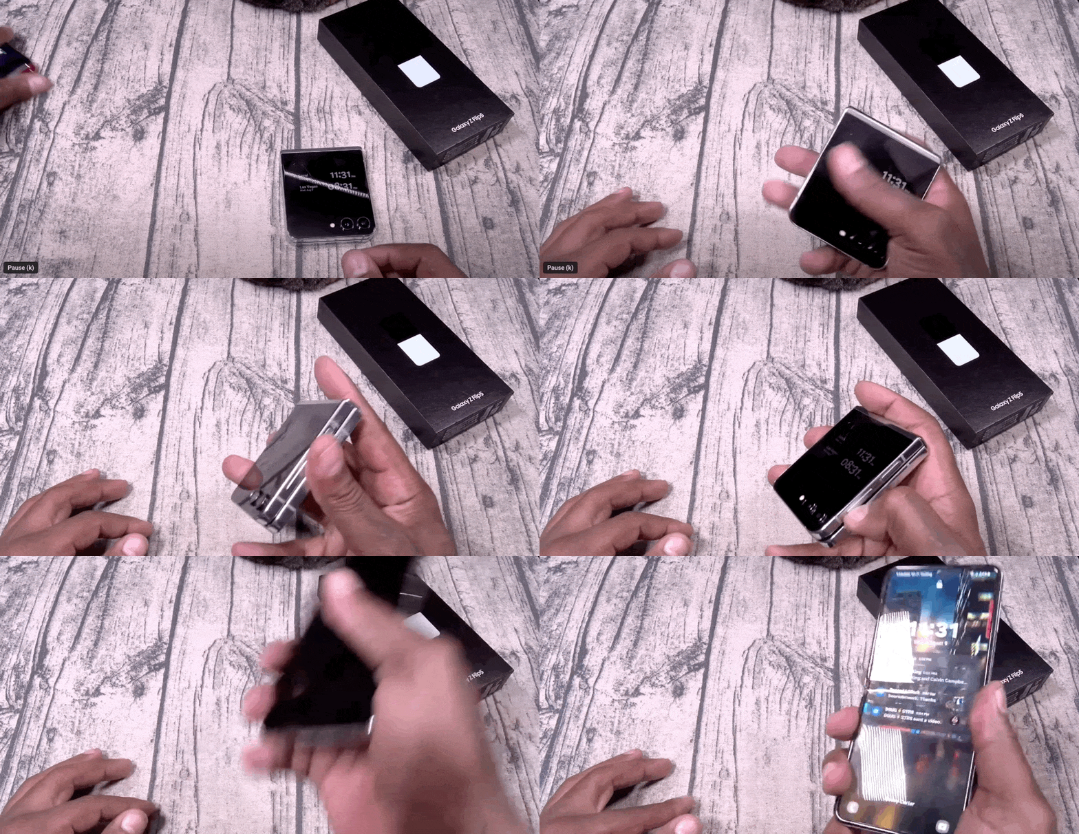
This is important because a comparison between Oppo’s Find N3 Flip and Samsung’s Z Flip 5 isn’t really about specs (but here’s a list if you’re curious) or how well they can score on the Antutu benchmark. It’s about how each phone makes you feel when you use it.
To that end, let’s talk about nicknames. I need to connect with a phone before I give it a name – here’s a phone I recommended, but didn’t earn that honor. My personal Z Flip 5 is called the Flippu-Flippu.
Three days into using the Find N3 Flip, I had two names for it: the Oppo Oppo No Mi or David Hasselblad. I stuck with David Hasselblad.
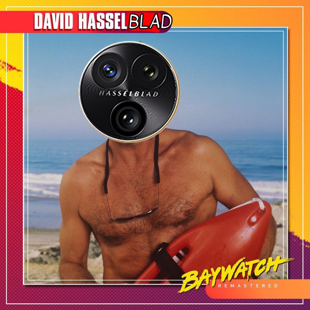
However, for purposes of this review, I’ll refer to the Find N3 Flip and Z Flip 5 as “the Oppo” and “the Samsung” respectively
Design : The Oppo Find N3 Flip is way more eye-catching, from box to phone
Both phones are similar from form to pricing. The Find N3 Flip retails for RM4,399 (12GB RAM + 256GB storage) while the Z Flip 5 launched at RM4,499 (8GB RAM + 256GB storage), though prices are likely lower if you find the right promotion.
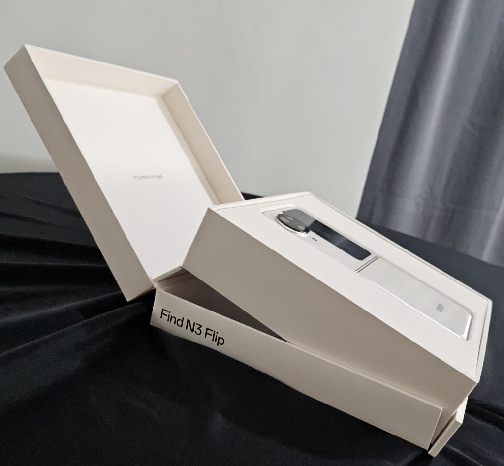
But the difference is visible straight from the packaging itself. Oppo gives you a nice hinged box that presents the phone to you while Samsung opted for a boring flat box that…well…is just a box. My retail box also came with a SUPERVOOC charger, cable and a two-piece case. Meanwhile, the Samsung came with a cable. It’s a small thing, but I kinda miss the days when opening a new phone was more of a ceremony rather than just plopping it out of the box.
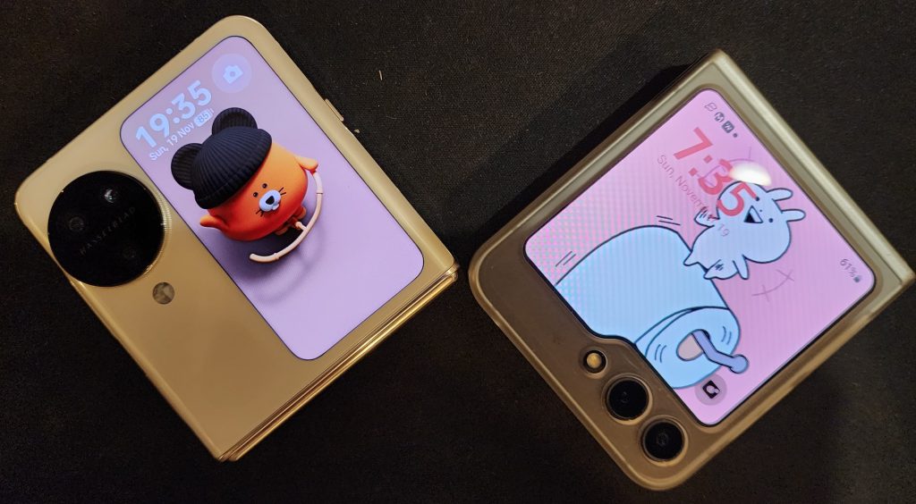
In terms of looks, I’d say that the Find N3 Flip is more artistic while the Z Flip 5 is more industrial. In fact, I’ve had two instances where a friend grabbed the Samsung at a cafe thinking it was an order ready buzzer.
The Oppo stands out a lot more with the contrast of the screen and round camera bump within a curved frame. On the other hand, the Samsung stands out way less with it’s full cover screen and squared-off edges. It’s like the Samsung is a phone I’d take to a bank meeting while the Oppo is the phone I’d take to a fashion show or a pitch meeting with a creative agency.
Since it’s a flip phone, the most important thing is the tactile feel when you open and close it. Both phones feel very different in this area. The Oppo opens in a very smooth motion and closes with a dignified “thup”. The Samsung requires a little more force and you can also feel a transition from stiffness to smoothness as it closes with a confident “click”.
Most of my friends preferred the Samsung because it felt “more sturdy”, but that’s with two-handed use. If you’re using your chin/lower lip to open the phone one-handed, it’s much easier with the Oppo. Overall, I’d recommend flipping both phones to see which you prefer (but don’t put a display unit to your mouth lah).
Where the Oppo takes the win, though, is in the fingerprint sensor, crease, crease nub, and flatness.
In both phones, the power button doubles as a fingerprint sensor. The slightly raised button on the Oppo makes it much easier to find and scan your fingerprint compared to the Samsung, which is more streamlined to the body. I’m personally not bothered by the crease, but the Oppo’s crease is less pronounced in feeling, and almost visually non-existent.
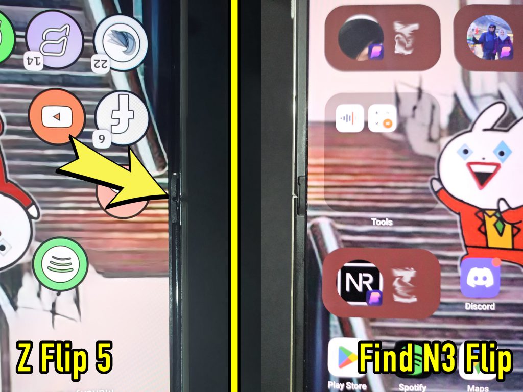
The crease nub (I don’t know what it’s actually called) is a piece of plastic that juts out at each end of the crease, and is part of the hinge design. On the Samsung, the nub has a protrusion scrapes your finger when you’re swiping from or towards the edge of the screen, especially if you use gesture navigation. That isn’t present at all in the Oppo. It also opens fully flat, unlike the Samsung (and some other foldables) that have a slight tilt.
Software : The Z Flip 5 has more customization options, while the Oppo Find N3 Flip is better out-of-the-box
Here’s an example, I absolutely hated the gesture navigation arrows on OneUI. The visual look was terrible and it didn’t have a function to go back to a previous app when you pulled further back. I only got those functionalities and look back when I installed GoodLock. Basically, GoodLock is a collection of experimental modules that allow you to really tweak the phone and add functions that it didn’t come with.
But with the Oppo, the gestures worked and looked exactly the way I wanted it to. No downloads or tweaking required. Oppo and ColorOS got about 80% of the tweaks I usually make with my phones right from the get-go. While I don’t use it, some of you may also appreciate the physical ringer setting switch on the Find N3 Flip.
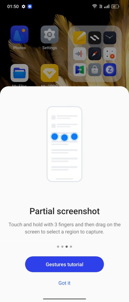
I also admire Oppo’s dedication to animate the crap out of everything. Like, there are animations for stuff that you’ll likely never notice. For instance, it took me a full week to notice that tapping on any buttons in a Picture-in-Picture screen produced a supernova-like flash. However, perhaps its for this reason that the phone felt more sluggish, because animations take time. I sped up the animation in Developer Options and it felt much zippier.
If you enjoy tinkering around with launchers and other customization apps, then go with the Samsung. But if you just want something that just works and looks good, go with the Oppo.
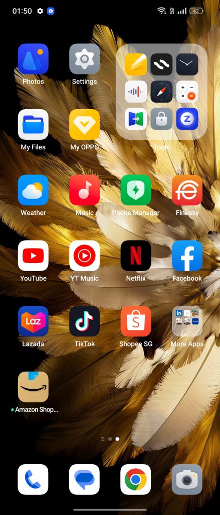
One thing both Samsung and Oppo are guilty of is bloatware. Samsung is notorious for preinstalling their own versions of Google apps as well as their Microsoft partner ones. However, the sheer randomness of the apps that came with the Oppo made me factory reset the phone, thinking that my review unit wasn’t properly wiped. Unlike the clearly Samsung-branded bloat, Oppo preinstalled random Play Store apps like Agoda, Booking.com, Lords Mobile, and Genshin Impact. They can (thankfully) be easily uninstalled if you don’t need them.
Screen : I laughed at the Oppo’s small cover screen. After a few days, I had to apologize
Cover screens are a big part of flip phones, and Oppo and Samsung have very different takes on them.
The Oppo comes with a vertical screen that’s roughly 30% smaller than the Samsung’s cover screen which covers most of the front panel. In terms of use, the Samsung uses widgets which requires multiple swipes to get to a function you want (ie, alarms or calendar) while the Oppo requires one swipe to get to a mini app launcher. While the pop-up continually warns some apps are not supported, I haven’t had issues with any of my apps except for Beeper, which does not show up at all.
Samsung also has an app launcher widget, but it only supports 6 apps by default, including YouTube, Netflix, and Whatsapp. To get it to launch any app, you have to – you guessed it – use GoodLock.
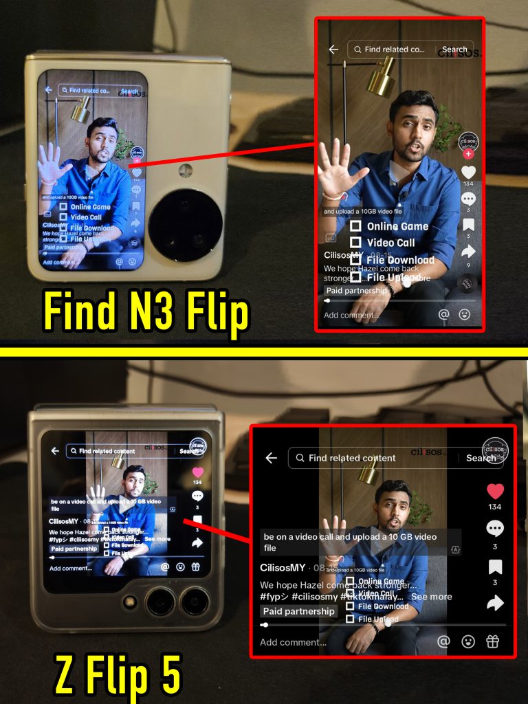
And while the Oppo’s screen is smaller, it’s actually the better execution because the proportions are the same as a regular phone. For instance, you can see two additional Whatsapp text lines on David Hasselblad, which makes a huge difference on a small screen. The biggest difference though, is in video. You can view vertical videos and pictures (TikTok, YouTube Shorts, Instagram) on the Oppo with no issues, while you’ll only see cut-off torsos (YouTube Shorts) or overlapping text (TikTok) on the the Samsung.
The Samsung has an advantage in landscape videos (YouTube, Netflix) where you can prop the phone up like a tent (tent-mode?) for a fuller image and a better viewing angle. Meanwhile, it’s a lot more awkward watching full screen videos on the Oppo (tent-ditiup-angin-mode?).
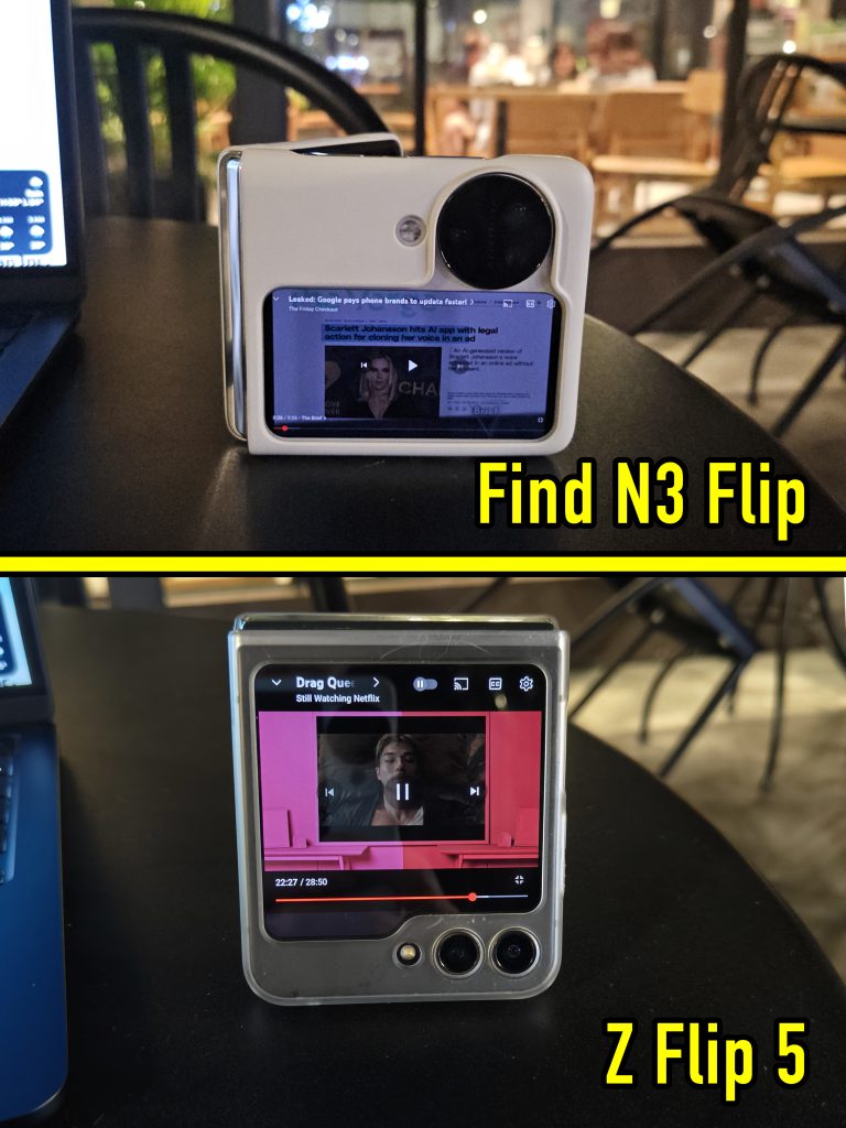
Overall, typing long replies or emails on both cover screens aren’t ideal but I’mma give Oppo the win on this. For videos, it really depends on the platform(s) of your choice.
In terms of the main (inner) screen though, both have AMOLED screens capable of 120Hz refresh rates, but Samsung’s is brighter with punchier colors. One thing to note though, the Z Flip 5’s screen produces warmer (yellowish) tones while the Find N3 Flip produces bluer tones which gives nicer white colors.
Battery & Performance : Both phones tie in performance, but Oppo’s battery is *chef’s kiss* 🤌
If I could only give one reason to pick the Find N3 Flip over the Z Flip 5, it would be battery and charging.
Charging a flip phone twice or more times a day is an accepted compromise due to their smaller battery capacities, but the Oppo changed that. With 4,300 mAh compared to the Samsung’s 3,700 mAh, I’ve been ending work days (9am – 1am) with 30% – 40% battery to spare. This means that I could go to sleep and still make it through half of the next day without charging. Meanwhile the Samsung requires a top-up every 8-9 hours.
It’s also no slouch with heavier use. I took the Oppo on a 3-hour drive to Pahang. Starting at 85% with Google Maps and YouTube running the entire drive, I arrived with 45% battery which was plenty for photos before I plugged it in for the night. So this is a 40% drop with the screen on the entire 3 hours.
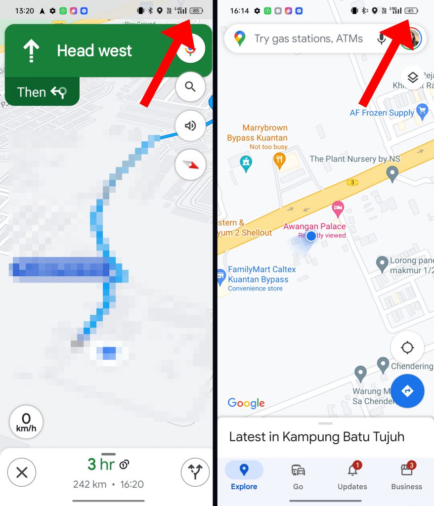
On the other hand, the Samsung drops 20% – 35% for a 40-minute drive with the same use scenario.
Unfortunately, the Find N3 Flip does not have wireless charging. Fortunately, you won’t need it. Coupled with the great (for a flip phone) battery life, Oppo’s included 67W SUPERVOOC charger can top the phone up from 10% – 85% in less than 45 minutes. Just make sure the Optimized Charging function is off, as that’s meant to trickle-charge the phone while you sleep.
Another win for the Oppo is the haptic feedback. While the Samsung’s haptics are good, it’s downright noisier and mushier compared to the Find N3 Flip.
On paper, the Samsung has the better processor – a Snapdragon 8 gen 2 optimized for Galaxy phones – while the Oppo comes with a Mediatek Dimensity 9200. In actual usage though, you wouldn’t notice a difference. Both phones ran smoothly without hiccups, though the Oppo didn’t heat up as much.
With gaming, it’s a different story. While both phones ran Genshin Impact just fine, the Oppo took almost 3 times as long to download and install the game files. This wasn’t a fluke either, because the same thing happened when I reinstalled it again. Both phones were toe-to-toe in terms of graphics and smoothness of gameplay, but the Samsung’s brighter screen and punchier colors looked better although the crease distorts the graphics. There’s no distortion on David Hasselblad unless you tilt the phone around looking for it.
As a responsible reviewer, I have to say this: please do not buy a flip phone if you’re a serious gamer. It’s like playing on a controller that folds in half when you get too excited.
Cameras : David Hasselblad lives up to its name, but…
So obviously David Hasselblad’s name comes from the prominent Hasselblad camera branding that appears on Oppo flagships. Objectively, Oppo’s phone has the better camera setup, with Hasselblad’s color tuning and camera features baked in:
- 50MP main
- 48MP ultrawide
- 32MP telephoto
This is compared to the Z Flip 5’s…
- 12MP main
- 12MP ultrawide
I will also point out that the Oppo’s vertical cover screen gives you a more accurate view when you use the main camera for selfies.
In my use, the Oppo produced less noisy pictures and was capable of zooming in further than the Samsung – 20x digital zoom compared to the Samsung’s 10x digital zoom.
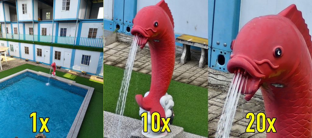
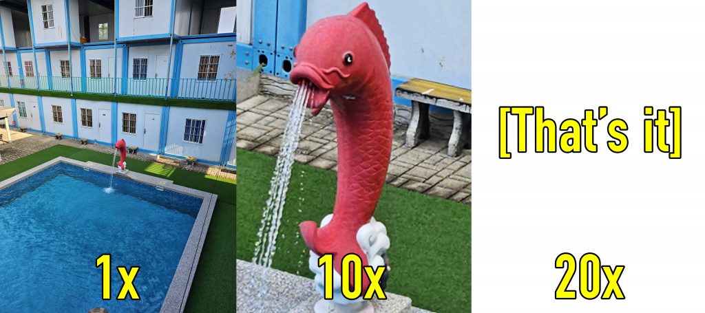
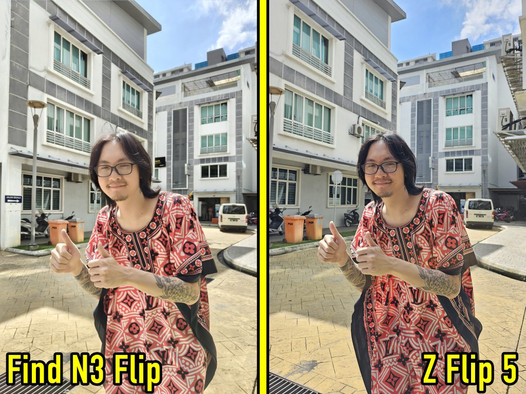
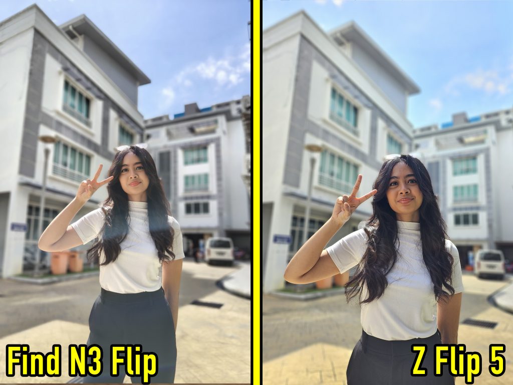
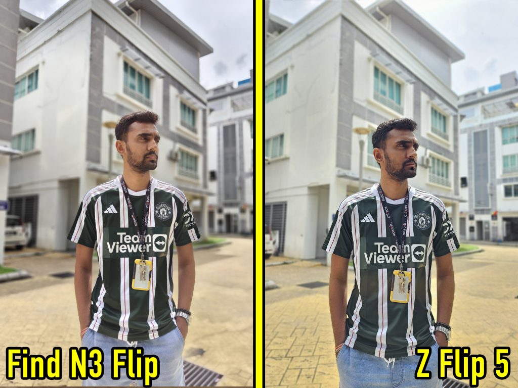
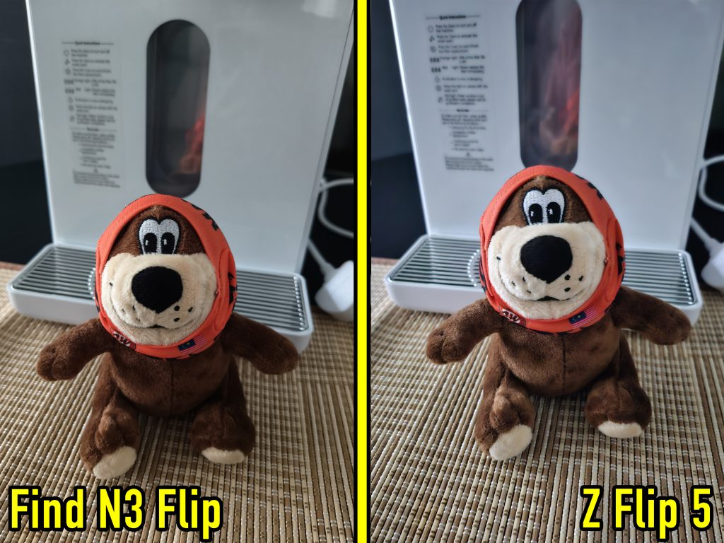
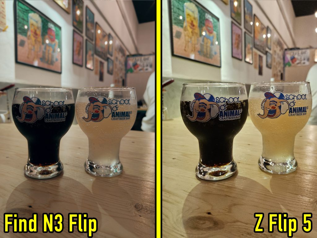
But here’s the catch. Everyone I asked preferred the Samsung’s photos over the Oppo.
And here’s the reason why:
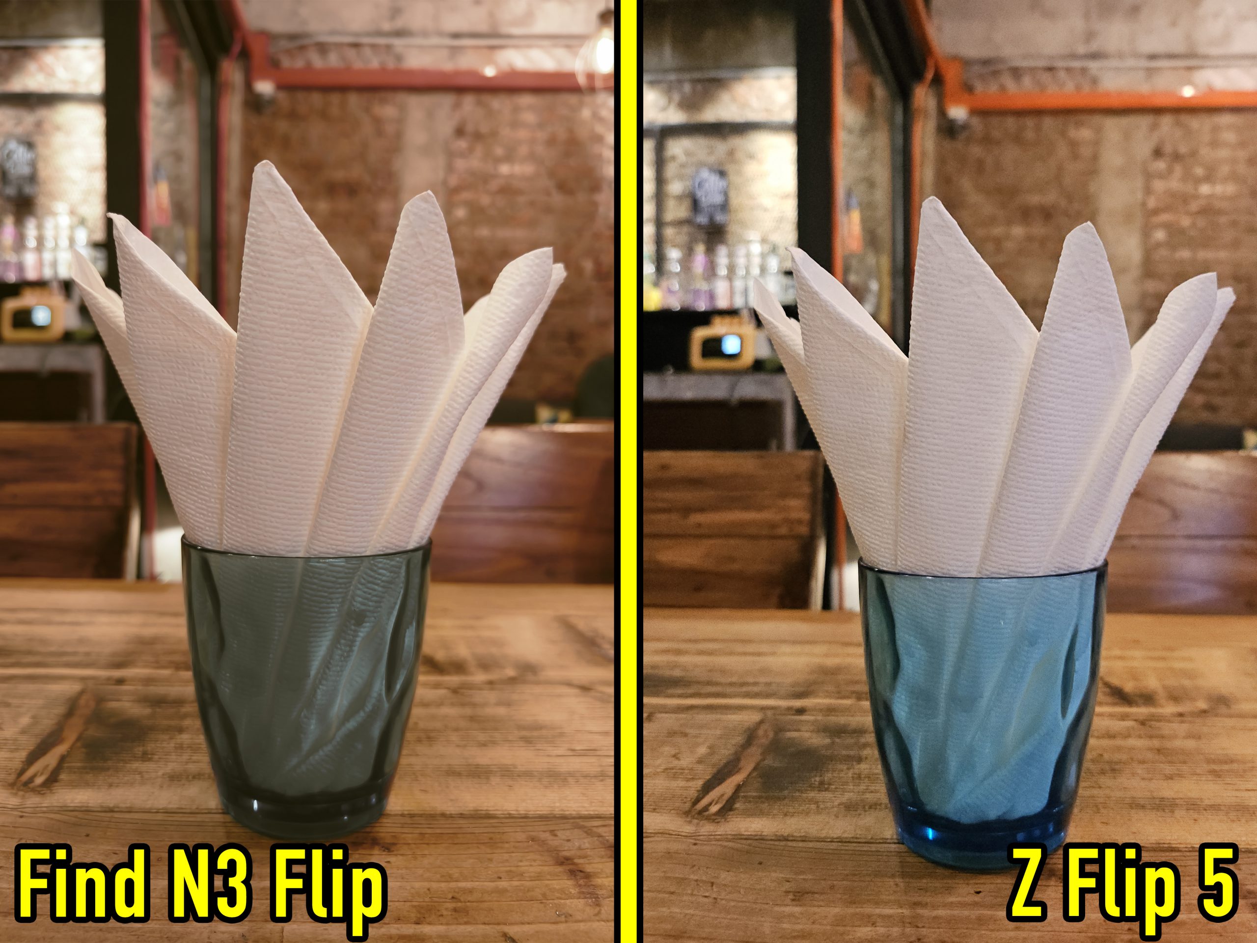
While the Samsung’s image looks better, it’s completely processed. The Oppo captured what the glass actually looked like in real life. To a lesser degree, this also applied to videos, with the Samsung’s output just slightly more saturated.
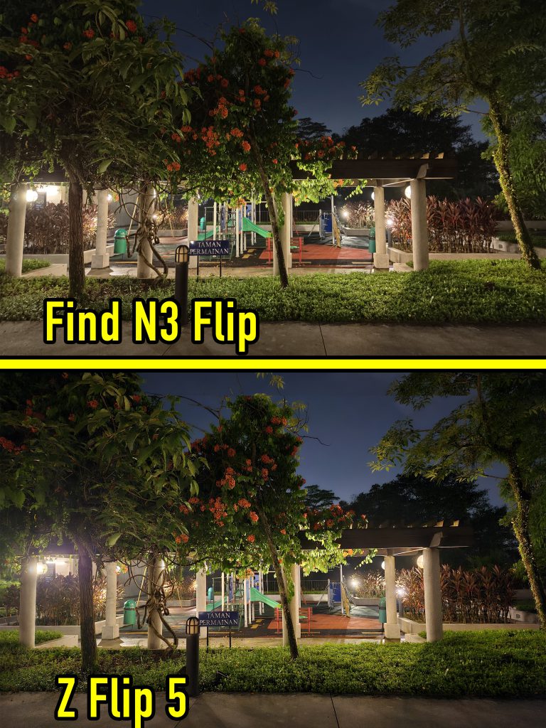
Here are some other comparison photos with just the default settings:
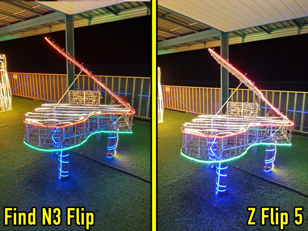
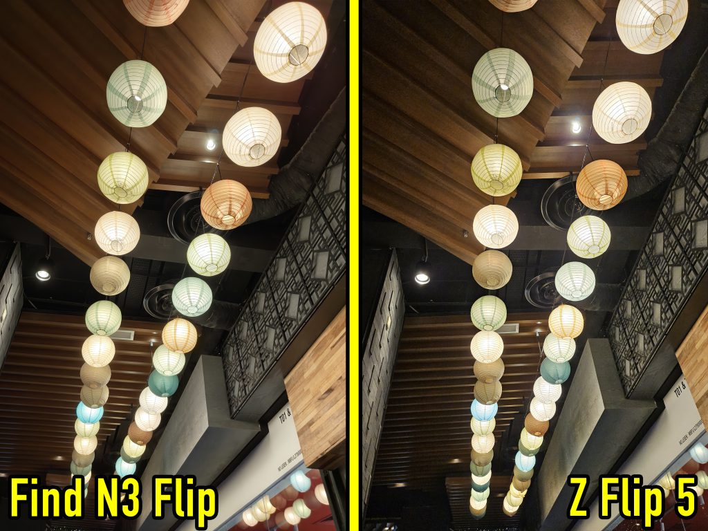
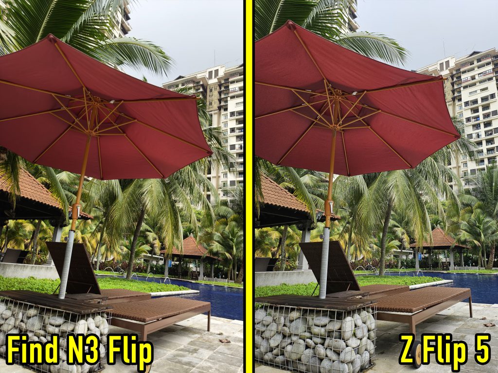
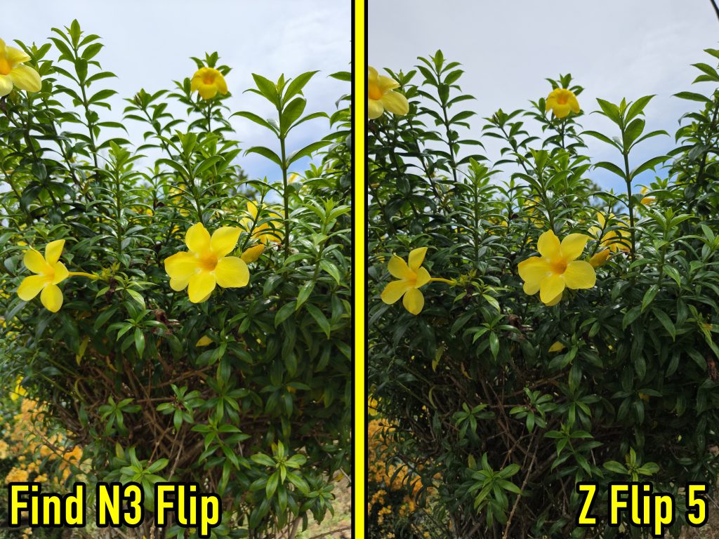
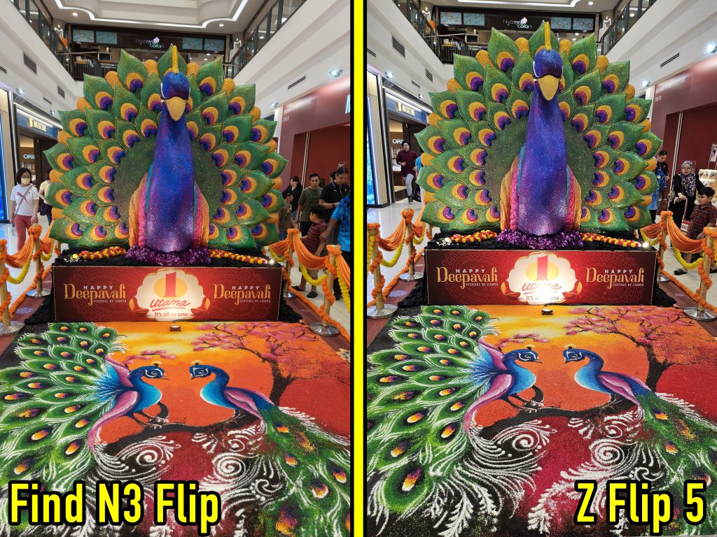
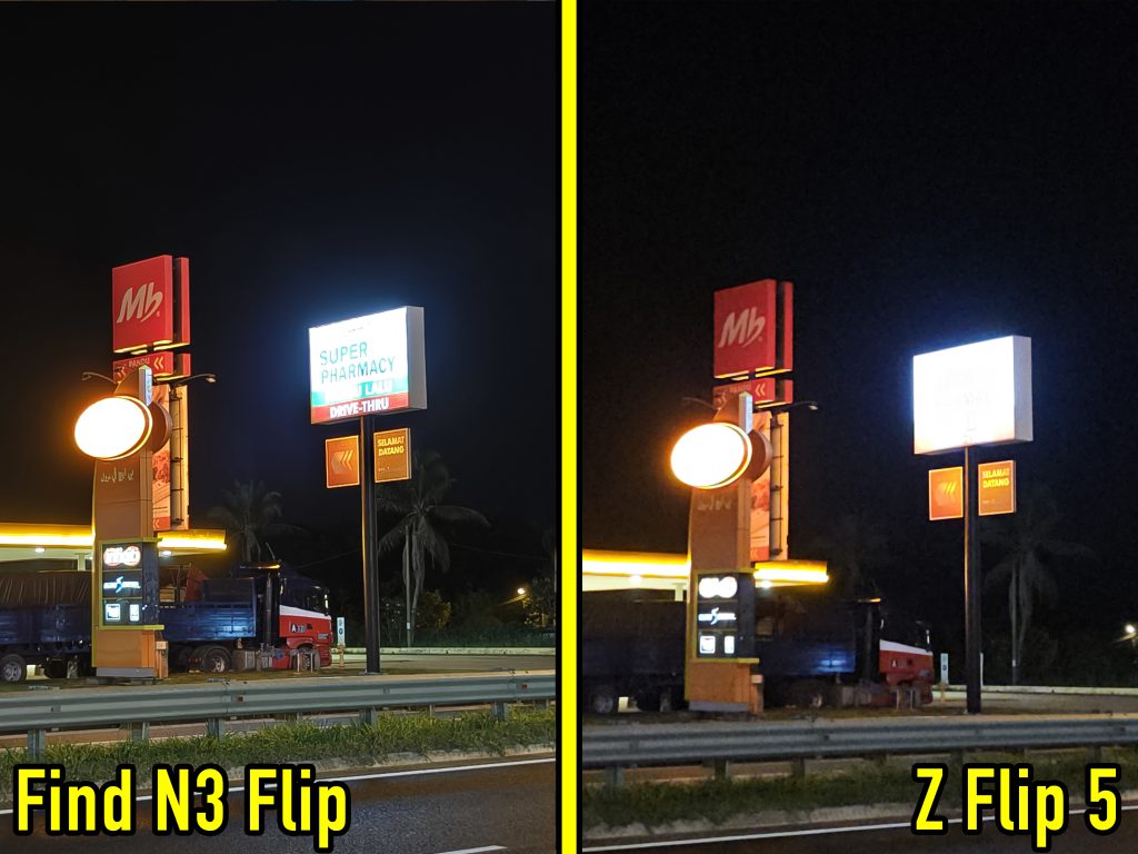
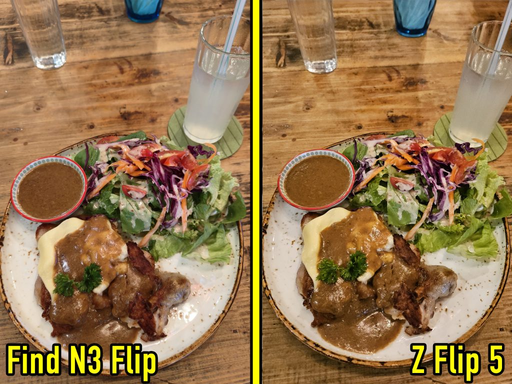
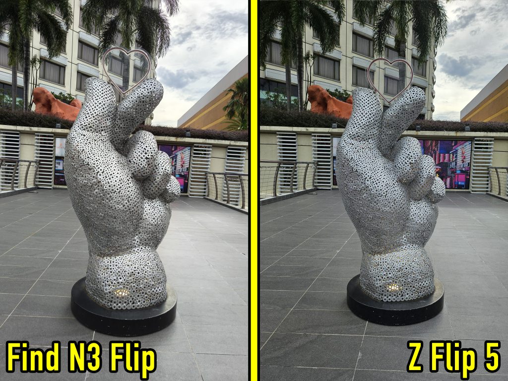
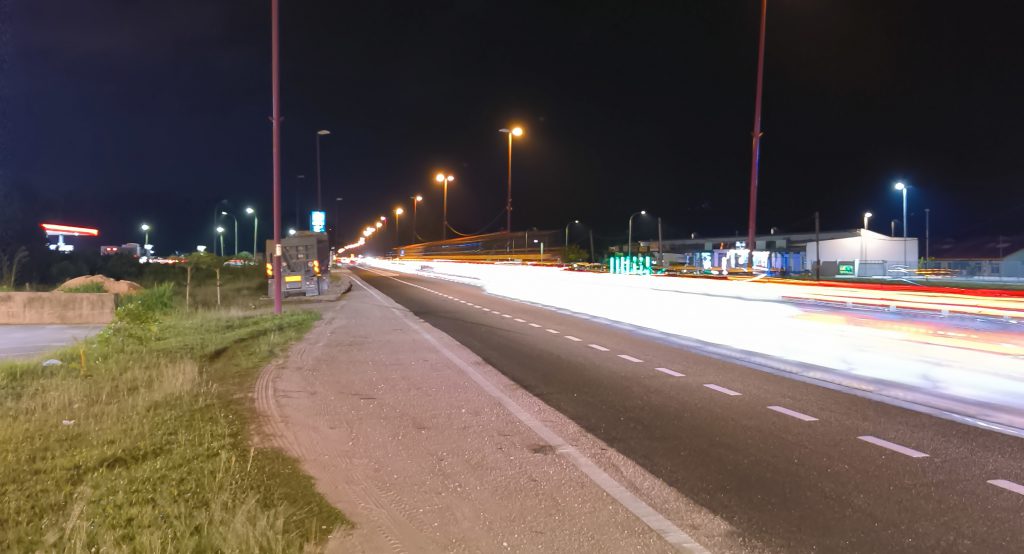
The Oppo also has some camera features that I haven’t properly mastered, such as XPAN for a cinematic wide angle, and the Long Exposure mode to get those cool car light trails at night.
So, rather than give the cop-out answer of “depends on your preference”, I think it’s better to say that the choice really depends on whether or not you plan to edit your photos. If you want something that is good enough to post as-is, go for the Samsung. But if you’re planning to slap on some filters, want true-to-life photos, or take more professional-looking pictures; you’d want pictures the Oppo produces.
I’m going to miss David Hasselblad 😭
Unfortunately, David Hasselblad is a review unit and he’ll be gone by the time this is published. If anything, my time with him has made me realize that I didn’t need to put up with many ‘flip phone compromises’ like battery life.
Again, a flip phone isn’t for everyone, especially if you’re comparing it to a conventional flagship phone. If you value high specs and performance, are a bit careless with your phones, or spend a lot of time on Mobile Legends; then go for a conventional flagship or gaming phone.
But if you want a flip phone with the less painful transition period, you won’t regret walking into an Oppo store and giving the Find N3 Flip a test run. And if you went because of this review, do me a favor and whisper “Hi David”.
- 190Shares
- Facebook148
- Twitter7
- LinkedIn10
- Email10
- WhatsApp15


