Which MP’s area has the most poor people? This interactive gomen website can tell you.

- 180Shares
- Facebook143
- Twitter7
- LinkedIn6
- Email6
- WhatsApp17
Ring the alarm bells! Fresh tea had been spilled, or should we say… sta-tea-stics. Or statis-tea… uh.

Yes, today’s tea comes in the form of statistics, but don’t close that tab yet, cause it’s fun data. Recently, our statistics department (the DOSM) finished the 2020 Population and Housing Census, and they kinda went above and beyond with processing it. An interactive site called Kawasanku was made, and its defining feature is that you can compare certain stats not only by state, but also by Parliament Constituency and State Legislative Assembly levels as well.
In other words, you can find out which MP’s or ADUN’s areas have the most old people, know which one’s the brightest at night, and even rank each of them by how much forest they’ve lost since 2000! Wow! This kind of data might feel a bit illegal to access, but Chief Statistician Datuk Seri Dr Mohd Uzir Mahidin had said that this could help the public and policymakers make decisions.
“In the past, people may think business and tourism will be affected when data such as pollution rates are shared. But now when we highlight such data, it will move people to respond and think of how to solve the problem. What we want is for the people to think critically, participate and play a role at all levels of society,” – Datuk Seri Dr Mohd Uzir Mahidin, as reported by The Star.
You can play around with the site yourself through this link, but here are some of the more interesting highlights.
Besides interior Sabah and Sarawak, Kelantan had the least access to piped water
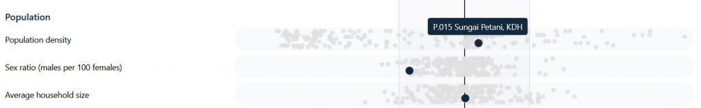
Once you select a state or constituency, the site will rank all states or constituencies based on the median (that’s the middle value in an ordered ranking), and you can see how the constituency you selected measure up to all the other constituencies in several aspects. While they did note that the dispersions are not meant to be perfectly comparable, it’ll give you a rough idea of how far a state or constituency is from the median.
If you scroll down to the bottom of the page, though, there’s also visualizations of the data in the form of maps. Like, here’s the map for access to electricity:
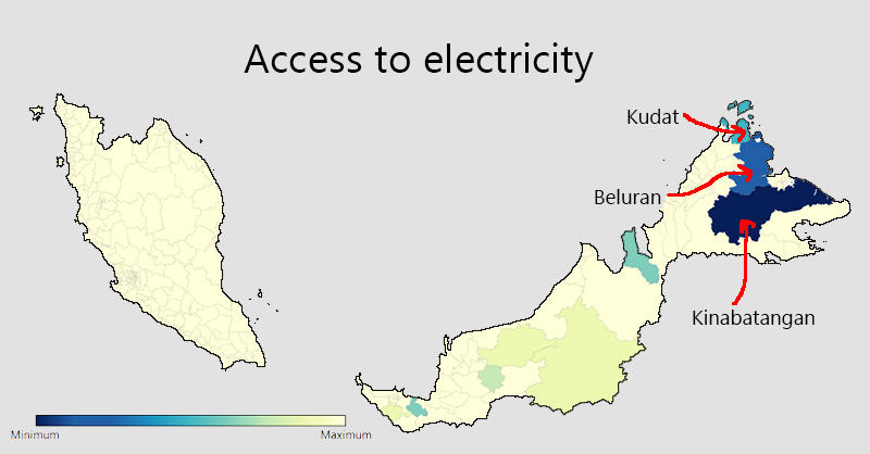
It appears that most of the Peninsula has access to electricity, but some huge areas in Sabah and Sarawak are still left out. The least covered areas are Kinabatangan (P187), Beluran (P183), and Kudat (P167), although only Kinabatangan was far below the median.
We’d expect the same to be the case for access to piped water, but perhaps surprisingly to some, Kelantan seems a bit pale.
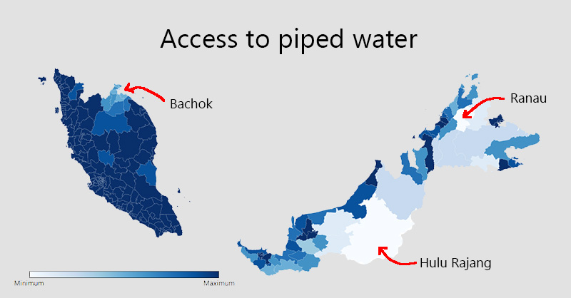
If we rank the accessibility by state, Kelantan is even further than Sabah and Sarawak from the median in terms of access to piped water. If you compare it by constituencies, though, the furthest constituency below the median would be P179 Ranau (Sabah), P216 Hulu Rajang (Sarawak), and then P025 Bachok (Kelantan).
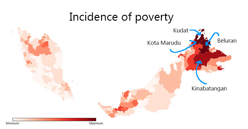
Sabah has the most poor people
When ranking each state by the incidence of poverty, Sabah has the highest incidence by a huge margin compared to the other states. This is followed by Kelantan, and then Sarawak. More specifically, Kudat, Kota Marudu, Beluran, and Kinabatangan are the most poverty-stricken constituencies. Sabah also leads in unemployment (along with Labuan), with the highest incidence of unemployment found in Semporna, Kalabakan, Kinabatangan, and Lahad Datu.
Just for fun, we checked to see whether these constituencies went through a lot of MP changes in the past. Because you can’t help but wonder. Apparently…
- Kudat and Kota Marudu are held by the same MPs since 2004, although their party affiliations had changed.
- Beluran is held by the same MP since 1999, although his party affiliations had changed.
- Kinabatangan is held by the same MP since 1999, and the same party.
- Semporna is held by the same MP since 1995, although his party affiliations had changed.
- Kalabakan and Lahad Datu had a new MP since 2018.
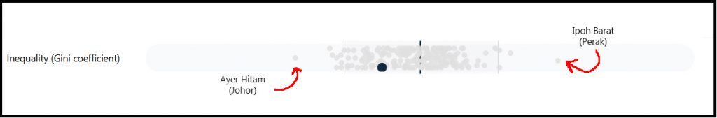
Interestingly, Kawasanku also mapped out areas by their Gini coefficient, which represents how huge the income/wealth gap is among people in a certain area. The areas with the highest ratio (most unequal) are identified as Ipoh Barat in Perak, while the most equal place seems to be Ayer Hitam in Johor. The rest are more or less near the median.
Negeri Sembilan lost the most forests in the last two decades
According to the rankings, five states has the least forest cover: KL, Putrajaya, Perlis, Penang, and Labuan. Unsurprisingly, these five states also suffered from the least forest loss between 2000 and 2021. The most forest loss, on the other hand, happened in four states: Negeri Sembilan, Johor, Malacca, and Pahang, in that order.
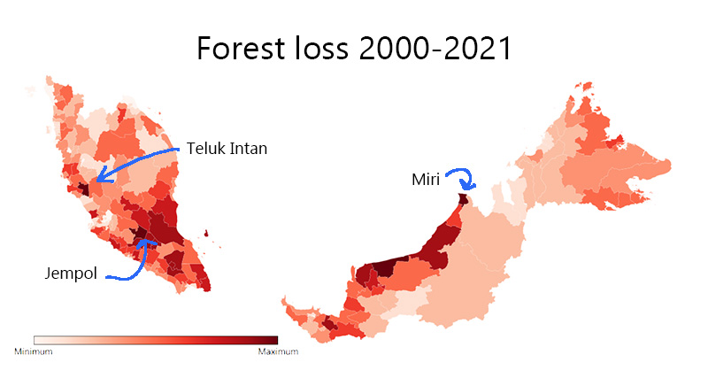
The biggest offending constituencies are Jempol (Negeri Sembilan), Miri (Sarawak), and Teluk Intan (Perak). Of interest, the most popular news on logging in Jempol was that the state government had cleared some forests in 2019 to install electric lines. So maybe not all forest loss is due to logging – some may be for general development.
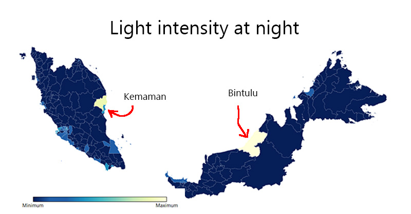
Speaking of development, Kawasanku also featured an interesting stat for comparison: how intense lights from certain areas are at night. This, according to the Chief Statistician, may indicate development.
“…for example, the light intensity at night shown on the visualisation map can tell us which areas are developed and which are not.” – Datuk Seri Dr Mohd Uzir Mahidin, to the Star.
Perhaps surprisingly, the brightest area isn’t anywhere near KL and Selangor: Terengganu and Sarawak are the brightest by a huge margin, followed by Johor. More specifically, the brightest constituencies are Bintulu (Sarawak) and Kemaman (Terengganu).
Wonder what’s going on in these constituencies? We’ll have to research more to find out, but for now, you might be jumping for joy and exclaiming…
“Wah! Who knew data can be so interesting?”

Okay, maybe not really jumping, but there are more intriguing data displayed on this new site than we can fit in this article, so maybe you’ll be jumping when you discover things like which areas don’t have enough clinics or which constituency produces the most babies. You can check those out yourself, and even see how your area stacks up against other areas to kill some time.
In the meantime, more features and data are expected to be added soon, and some of them sound quite ambitious.
“I want it to be possible one day for data such as how many people sought treatment at a clinic to be available too. Then we can know about health issues affecting each area. Such data can help people to be more health-conscious. Otherwise they will become complacent,” – Datuk Seri Dr Mohd Uzir Mahidin, as reported by The Star.
Will it happen? Will policymakers and politicians eventually use it? Will they get competitive and turn Malaysia into an advanced utopia? We’ll have to wait and see.
- 180Shares
- Facebook143
- Twitter7
- LinkedIn6
- Email6
- WhatsApp17