MOH raw data shows the daily positive numbers we’ve been getting are… wrong?

- 422Shares
- Facebook349
- Twitter9
- LinkedIn4
- Email8
- WhatsApp52
For a lot of us, checking the daily C19 cases is like checking the weather; you do it before deciding if you wanna go to the office, grocery shopping or a trip to Langkawi… but what if we told you there’s a possibility that the daily cases published by our Ministry of Health might be wrong?

Before we get flamed to death in the comments, let us explain. Y’all already know that the Ministry of Health (MoH) publishes C19 data every day on various platforms. That’s nothing new. What is new is every since Khairy took the spot as our new Health Minister, there’s been a wave of raw data that’s been dumped on the Ministry’s github repository (for our purposes, think of it as a warehouse where people can store their code and/or data).
That raw data gives people like Aimrun, who’s got a background in engineering and data analysis, opportunities to really really dig in to find super interesting things – ya know, like how he collab’d with us to do this C19 comorbidities thing.
So, he actually contacted us last week and said “Hey, I found something weird in the data on the MoH’s github.” and that turned out to be…
The numbers of C19 cases and stats from dead people don’t match

This is gonna be a bit technical, but we’ll try our best to simplify it for you guys, so stay with us. Aimrun has been exploring said MoH repository and he found a little something something in the “deaths reported” section – there might be a time gap between actual new infections and what’s been reported in the media.
See, based on the data that the MoH has, the average fatality rate for C19 patients in Malaysia is about 1%, but when Aimrun plotted the numbers out, there were a lot of points in time where it didn’t match the 1%. For most of you, it doesn’t mean much because surely numbers fluctuate from day to day, right? But wait, he dug deeper and found everything we’re about to tell you.
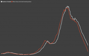
- The white line represents the number of C19 deaths since January of this year; and
- The red line represents the dates of when the patients were tested positive
The numbers look a little shifted which is natural, because when patients are tested positive for C19, they succumb days or weeks later. The lines roughly align, which means no alarm bells should be ringing in anyone’s’ head. If you don’t get this one, its okay, this one sekadar background sahaja. You’ll wanna save your brainpower for the next graph…
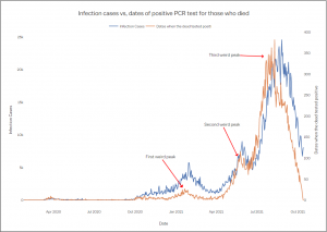
- The red line is the same as before – dates of when patients who died tested positive; and
- The blue line represents the positive cases reported by the MoH daily.
Things become… awkward when you compare the red line to this newly added blue line. By right, these two lines should more or less be aligned, but they’re not. This trend of inconsistency isn’t limited to just one day; it’s been happening for at least ten months now. As a matter of fact, the numbers of those who died peaked earlier than the infections at least three times in the past ten months (pointed out in the graph dekat atas).
Ya’ll can check out this super neat deck that Aimrun made if y’all wanna check out the inconsistencies in even more detail!
What does this all mean? Well… it seems like new C19 cases that we see every day might not be up to date.
But why has this been happening, and whose fault is it?
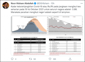
We’re also not sure what the exact effects of this shift in data are, but what we do know is that DG Noor Hisham’s infectivity calculations might be very, very off. Also, it’s really hard to tell why exactly the numbers look skewed without official confirmation, and we’re not looking to accuse anyone of anything but… several possibilities come to mind:
- Projecting higher positive case numbers would give someone a very valid reason to implement something like a lockdown, and uh, maybe have the Parliament be inactive on the side
- Everything could’ve been done to delay a full on panic or to make it look like certain efforts to control the situation were paying off
- Or… maybe there’s no conspiracy here and all the reports coming from hospitals around Malaysia – some of them in digital format and some analog – have created a backlog, forcing them to constantly play catch up
Regardless of whether you think this is a conspiracy by the gomen or just inefficiency on their part, the important thing is that they made the data transparent which gave people like Aimrun the opportunity to question the status quo instead of just having us looking at declining cases through our rose tinted phone screens without knowing whether anything’s going wrong… even when everything seems to be going wrong, like right now.
- 422Shares
- Facebook349
- Twitter9
- LinkedIn4
- Email8
- WhatsApp52