7 things you’ll find in (almost) all Malaysian Movie posters
- 2.7KShares
- Facebook2.6K
- Twitter3
- LinkedIn1
- Email4
- WhatsApp9
*Artikel ni ada dalam Bahasa Melayu, tekan sini untuk baca!
Fire, motorcycles and… hands?!
A good film is only as good as its poster. It makes no difference if you’ve assembled a Cameronian-winning cast and a budget comparable to the GDP of Perlis: no one will come to your film if its poster looks like it belongs more in a modern art museum than a movie theatre.
Fortunately, most graphic designers know quite a few tricks to get audiences excited about their films. Problem is, everyone and their grandmother seems to know them too. Which results in some posters looking..awfully sameish.
1. BLUE VS ORANGE
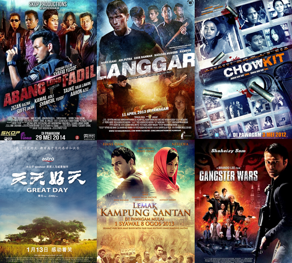
If you are a local film poster designer, it is pretty safe to say we know what your favourite colours are.
Why are these hues used so often? Well if you’d paid attention in Pendidikan Seni, you’d know that blue and orange are complimentary colours, at opposite ends of the colour wheel. They thus contrast strongly with each other, creating a strong visual experience.
Blue and orange can also represent many things: fire and ice, land and sea, day and night, pulut inti vs sponge cake, Penang FA vs Orange Felda United..you get the picture.
Warning: after you’ve read this, you will see this contrast EVERYWHERE. We are sorry for spoiling your future movie experiences.
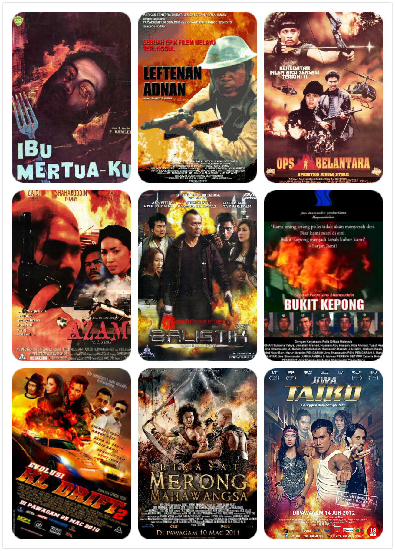
2. FIERY BACKGROUNDS
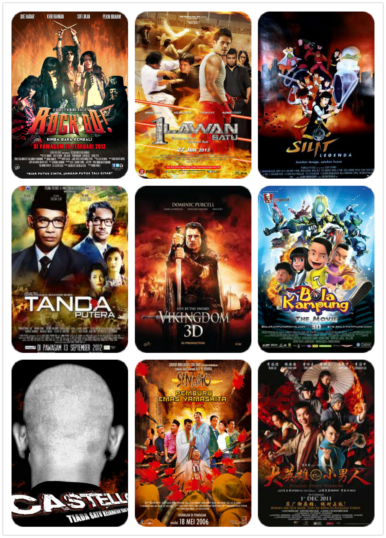
We’re guessing the Balai Bomba in Malaysian Movieworld are vastly overworked, having to extinguish the fields of flame that appear every time a bunch of actors pose dramatically together.
This is actually a pretty common visual cliche, even in Hollywood: how better to illustrate how AWESOME and DRAMATIC your film is, by literally having your cast ON FIRE?
(Disclaimer: Please do not literally set your cast on fire.)
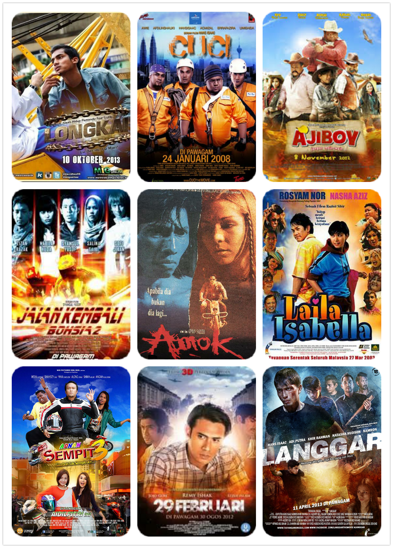
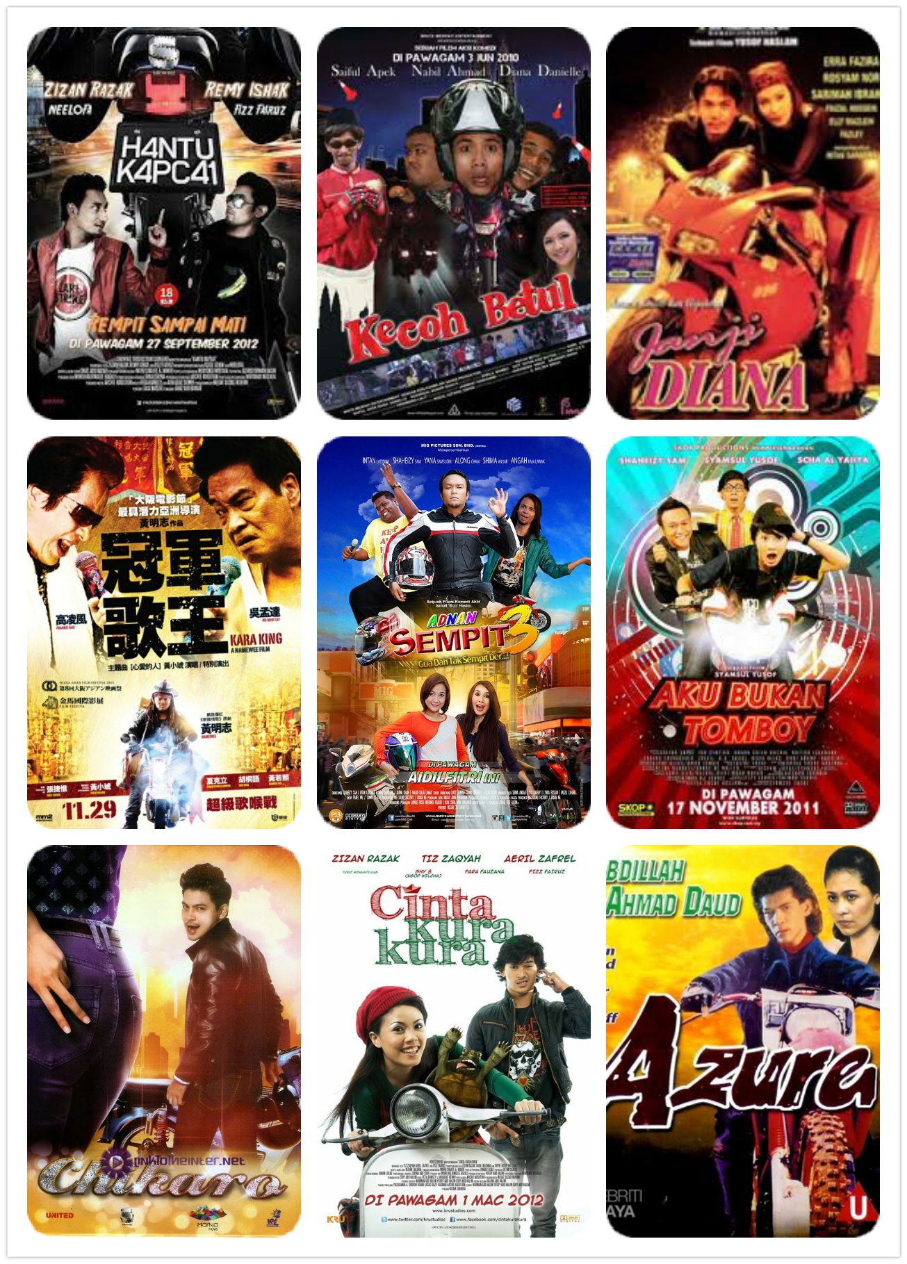
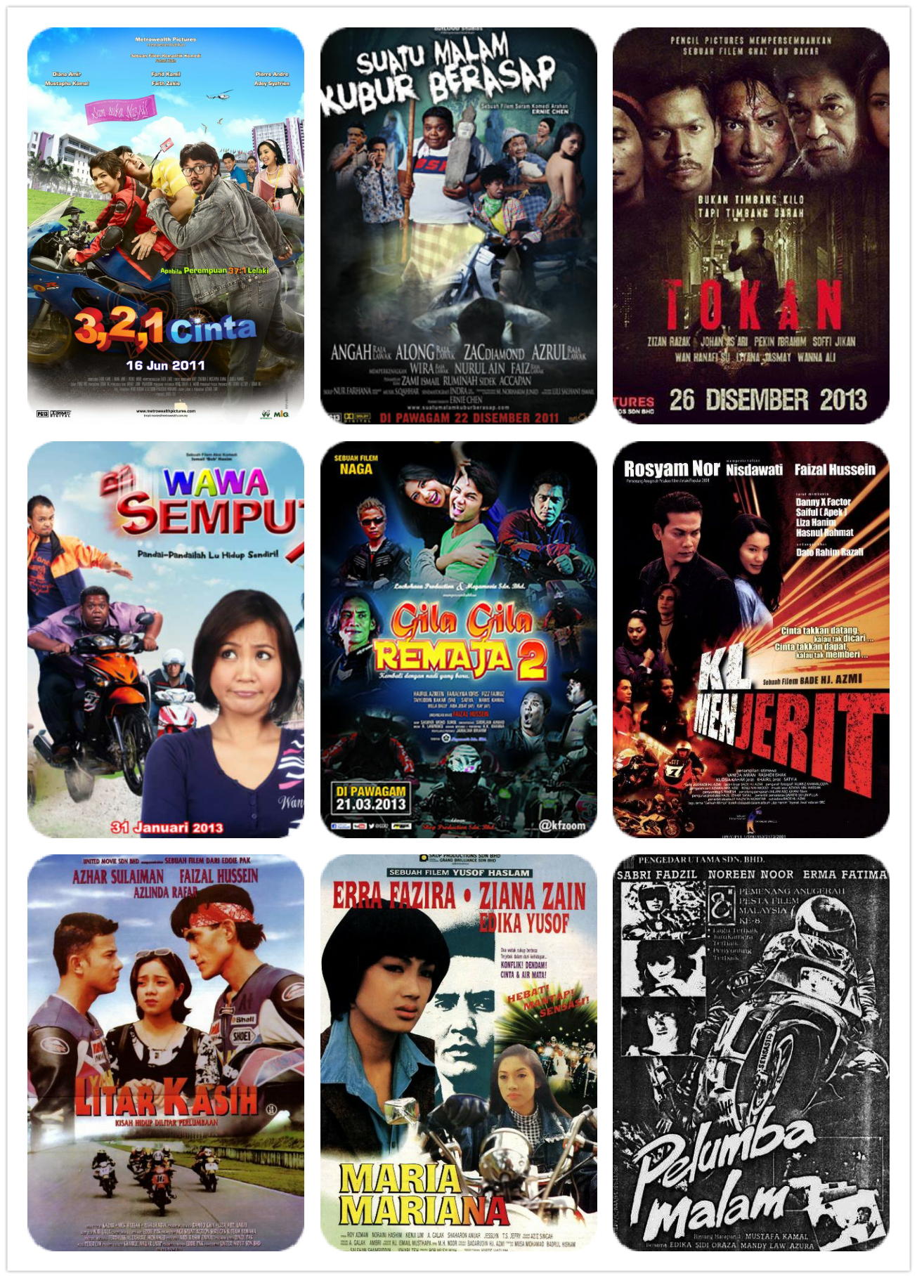
3. MOTORCYCLES
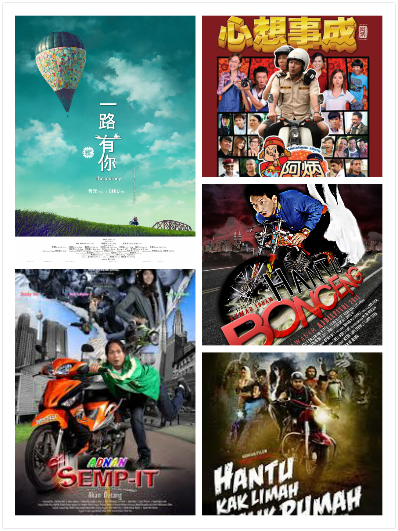
Newcomers to the local film scene are probably thinking Harley Davidson sponsors all our movie studios. There’s a simple reason for the abundance of these two-wheeled vehicles on our movie posters: there’s an abundance of movies about them!
Motorcycles are the new hot babes: whether its action, romance, or horror, you can always put a bike in there somewhere. There are tons of Malaysian films centred around motorcycles: they are after all, associated with rebellion, freedom, and excitement, all fundamental elements of the movie-going experience.
In fact, five out of the top ten highest grossing Malaysian films of all time feature motorcycles in some way!
Seriously, you could probably make an entire website devoted to ‘Malaysian Film Posters with Motorbikes’.
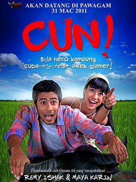
We’re sort of in love with the poster for Cun (2011), which appears to be making fun of this.
Because who needs a souped-up kapcai when you can travel by buffalo!
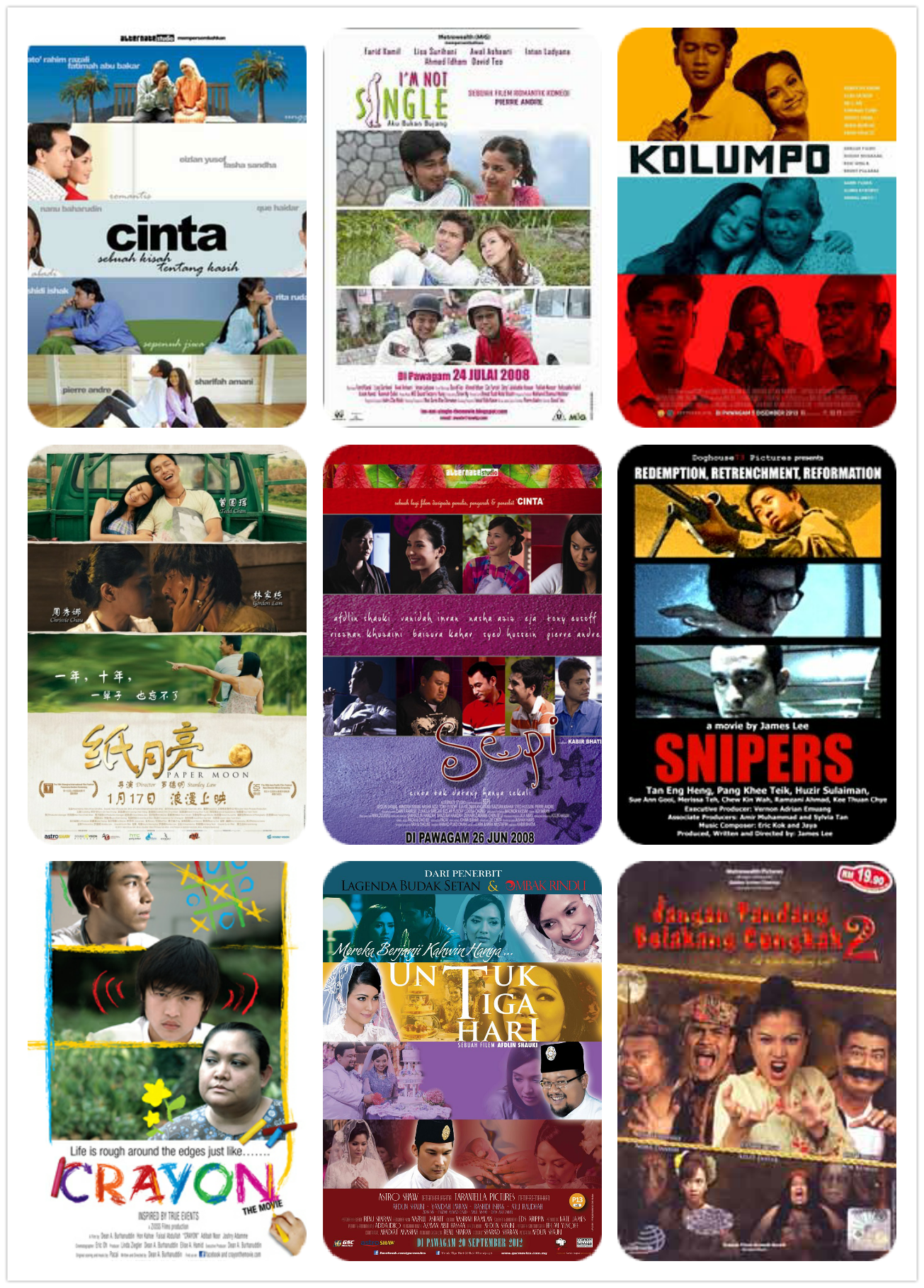
4. SPLIT POSTER-NALITIES
If split-screens are good enough for Playstations, they’re good enough for movie posters.
Turning your poster into a duplex (or triplex!) is a quick and visually compelling way of illustrating that your characters live in completely worlds, or are detached from each other. It is often used for anthologies or films about worlds colliding.
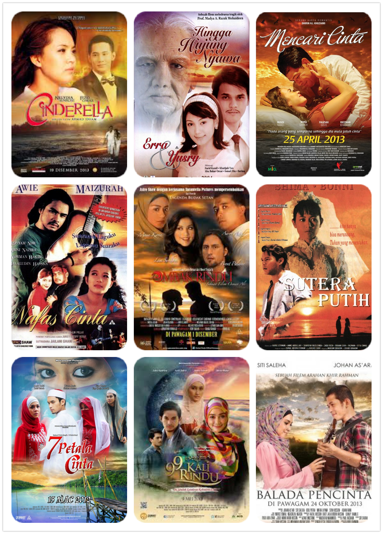
5. (ALMOST) ALL ROMANCE MOVIES HAPPEN AT SUNSET ON THE BEACH
Not pictured in the posters: the tedious process of getting sand out of their baju kurungs later.
We’re surprised anyone manages to get any sandcastle-building done with the abundance of lovey-dovey couples staring into each other’s eyes on Malaysian movie beaches.
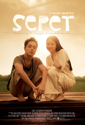
We’re almost glad that the late Yasmin Ahmad, rebel that she was, chose to go the other way, instead framing her first movie poster in glaring noontime sun:
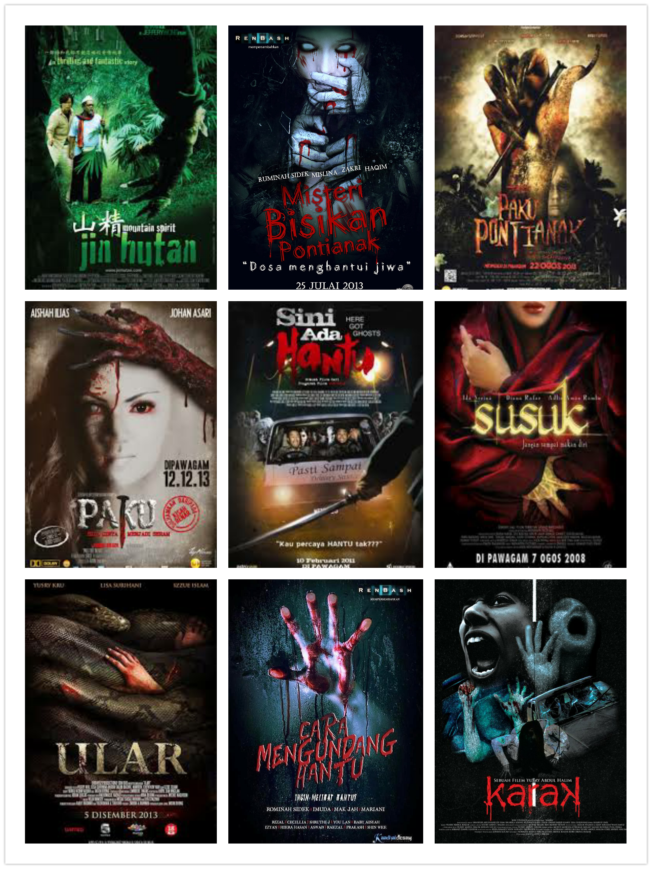
6. A ‘HANDY’ IMAGE FOR HORROR MOVIES
Is it just us, or do local horror movie poster designers have a bit of a hand fetish?
You have to ‘hand’ it to them: when it comes to creeping menace, there’s nothing like the outstretched limb of a creature out to get you! Lets hope you’re well ’armed’ against these monsters.
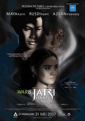
A notable exception, however, is the poster for Waris Jari Hantu (2007).
Its title even had the word ‘finger’ in it! The designers could have easily just stuck a hand there and called it a day, but luckily, were more creative than that. I guess they deserve a..thumbs up!
(Okay I’ll stop with the puns)
7. EVERYONE GET INSIDE THE PICTURE!
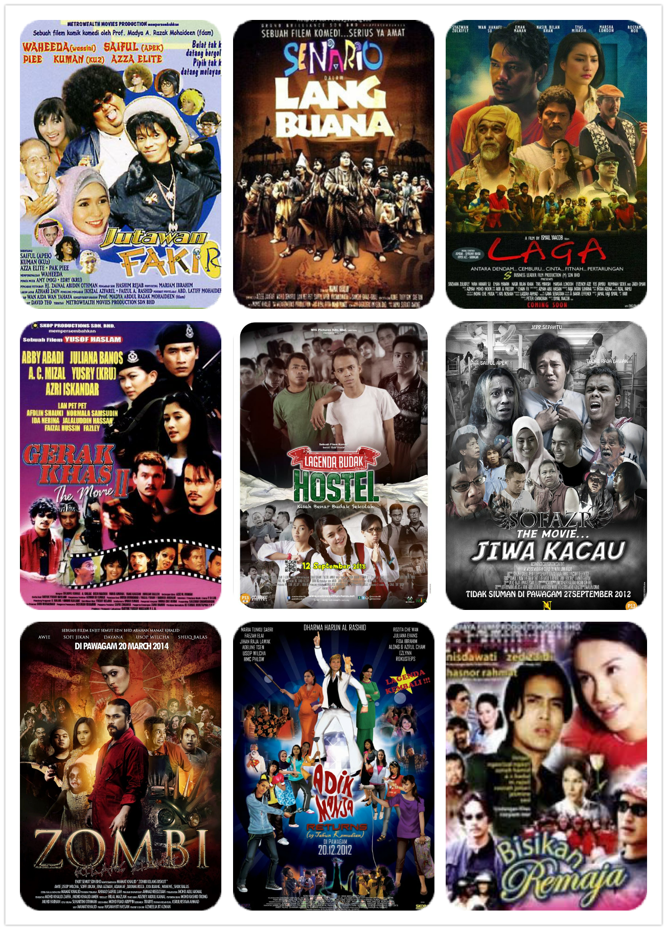
We Malaysians are a friendly lot. When we do anything, we like to get all our friends together. This apparently extends to making our movie posters, where designers strive to cram the most number of characters into the smallest amount of space as possible.
Local Chinese films seem particularly fond of this, with many posters containing more people than your average reunion dinner:
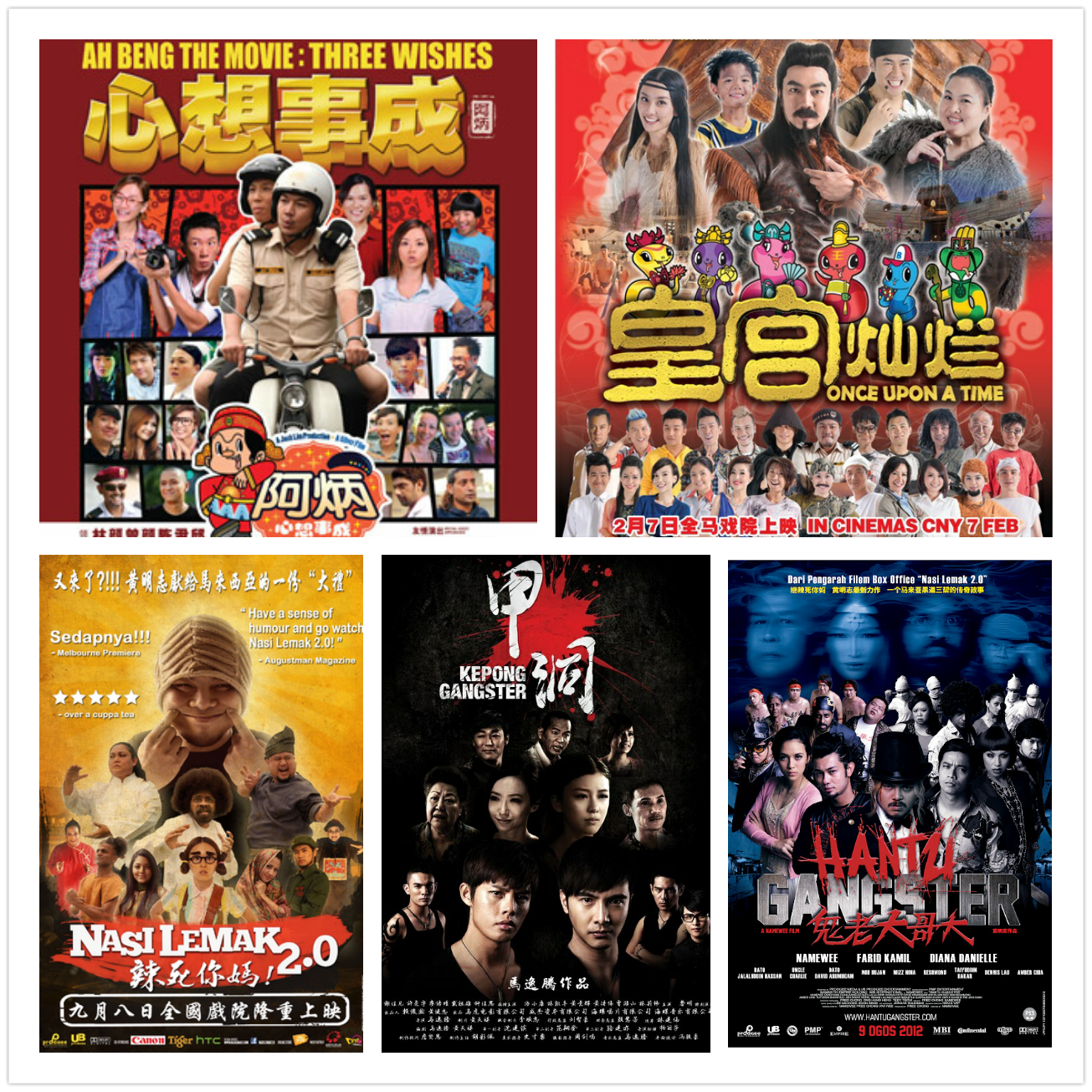
Seriously, some of them look like they feature every character from their film, from Male Lead to Henchman #64!
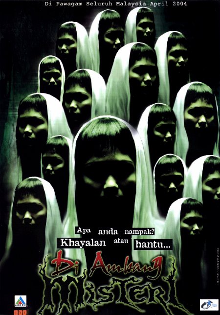
Our favourite overpopulated posters, however, have to be Di Ambang Misteri (2004), where the designers learn Copy + Paste works on ghosts as well as humans:
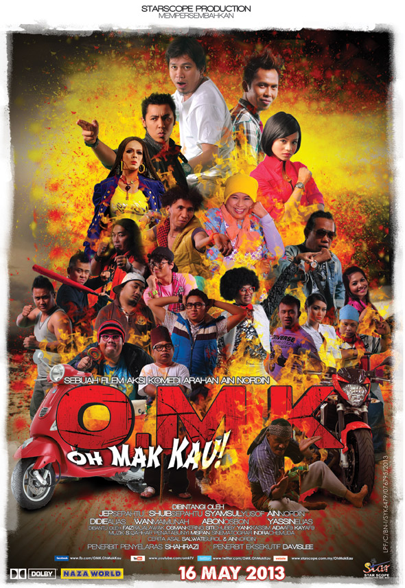
As well as the one for Oh Mak Kau (2013):
Tons of people? Check. Fire in the background? Check. Motorcycles? Check!
Congratulations, Oh Mak Kau. You might just be the quintessential Malaysian movie poster!
All movie poster visuals taken from Posterfilem and Filemkita. Copyright for each poster belongs to its individual movie studio. Special thanks to Evelyn Toh for help with movie poster collages.
- 2.7KShares
- Facebook2.6K
- Twitter3
- LinkedIn1
- Email4
- WhatsApp9

