KJ wants to make the MOH more “transparent”. We checked for changes.

- 309Shares
- Facebook288
- Twitter4
- LinkedIn4
- Email5
- WhatsApp8
Ever since we’ve been stuck at home looking at positive case numbers, the words “transparency” and “MOH” (Ministry of Health) have rarely been put together in the same sentence. With some criticism from politicians, and people accusing the MOH of being hanky-panky with the data, it seemed that the government’s handling of the pandemic was running into some serious trust issues.
And it seems that our new Health Minister Khairy Jamaluddin agrees. After being sworn in as our new Health Minister at the end of August this year, he set a list of KPIs for his first 100 days of ministership – one of which was the promise to provide more data transparency in COVID-19 management.
Of course, you might be thinking that 11 days might be too soon for a review but, from the number of times we had to rewrite this article, it’s a safe bet that you’re gonna be pretty surprised. Speaking of surprises, this transparency likely isn’t the transparency you had in mind because…
“Data Transparency” is more than just daily COVID-19 case reports.

In his announcement, KJ mentioned that some of the new data that would be made available to the public would be:
- The source of infections – Where the COVID-19 infections are coming from.
- Brought in dead [BID] cases – COVID-19 related deaths that occur outside hospitals.
- Concerning Adverse Effects Following Immunization (AEFI) incidents – Undesired, serious side-effects of the vaccines.
Unlike the usual colorful charts and numbers we’re used to seeing, this data – available on the MOH’s GitHub page – is granular; meaning you’re getting the nitty-gritty details instead of “today got 20,000 cases”.
All this detail could help everyone get a better understanding of the situation, allowing you to check for yourself if the MOH’s data is legit. And, of course, it’ll help researchers suggest policies or even predict infection trends.
But there’s a problem though.
The data looks like this:
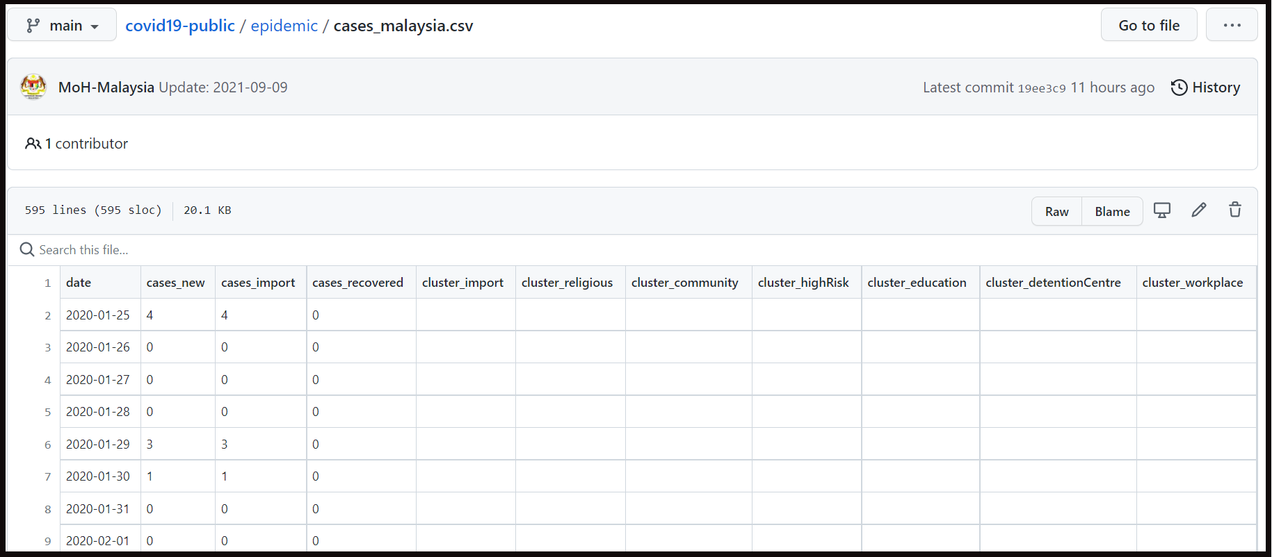
For those of you who are unfamiliar with the platform, GitHub is an open source repository for all sorts of digital stuff (like code) which means that it is something that people can publicly access and share. However, there is a pretty steep learning curve in navigating through it.
The other issue with this is, unless you’re some data analysis geek or a professional in the field, the format of this data probably doesn’t make too much sense. Not to mention, looking for this data and information isn’t exactly an easy task, as you’ll probably need to go on a deep dive to be able to find what you’re looking for.
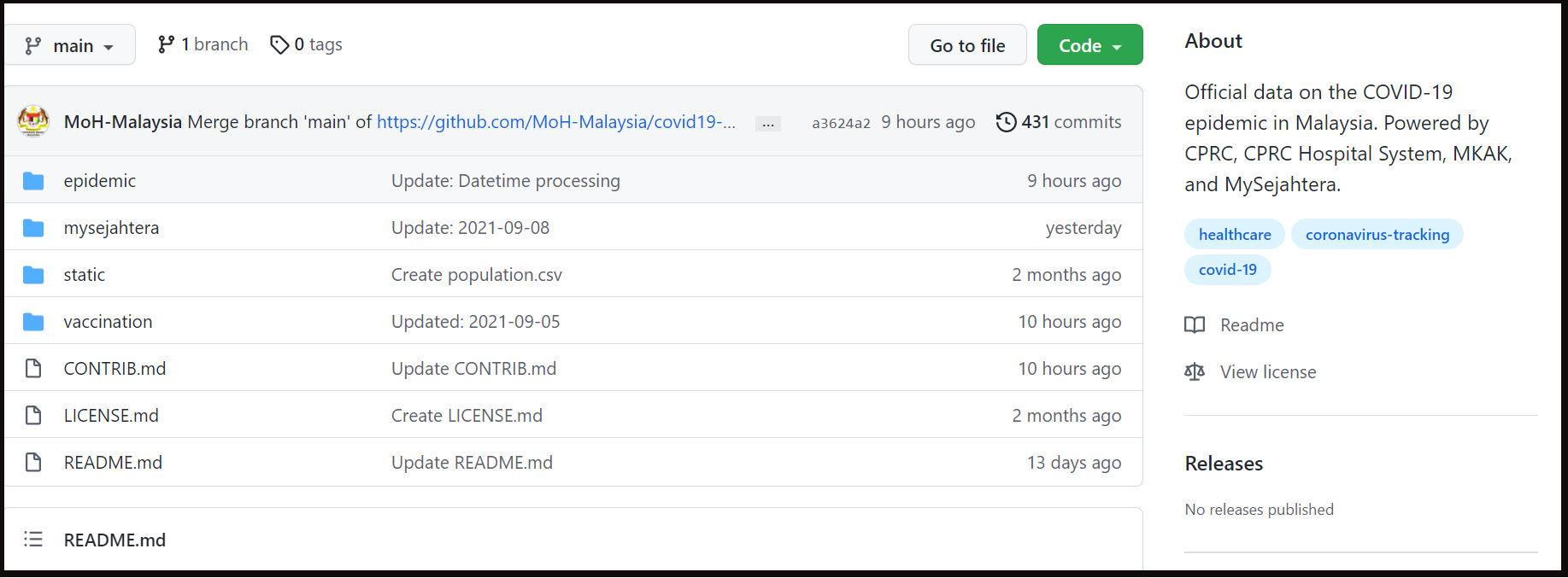
Case-in-point, upon first entering the MOH GitHub page, you’ll come across this pretty confusing main page full of files, folders, and directories:
So while the MOH is keeping their word on making the data more transparent to the public, it’s also likely your very public eyes have already glazed over from reading our explanation alone. We spoke to Dr. Khor Swee Kheng, an independent health policies specialist who stated that, while the GitHub information is a good start for transparency by the MOH, there’s definitely still much room for improvement.
“Firstly, more datasets should be released, instead of the narrow datasets that form the basis of the daily press statements anyway.
Secondly, the methodology and denominators of the datasets should also be clearly announced, so citizen-scientists can use the correct methodology and denominators.” – Dr. Khor, to CILISOS.
And with Dr. Khor’s thoughts putting a nice end to this article, we were just about to hit the Publish button when – plot twist –
They came up with a more “readable” website.

Woah. Slow down KJ.
Just as we were about to publish this article, the MOH announced the launch of a new website called COVIDNOW, where daily COVID-19 related data would be updated at 11.59pm each day.
According to the COVIDNOW website, the information was taken from the MOH and CITF (COVID-19 Immunisation Task Force) GitHub pages. So, we did a quick comparison between the data found on both platforms and discovered that the information published on the COVIDNOW website was the same data found on their GitHub pages, but just easier to understand.
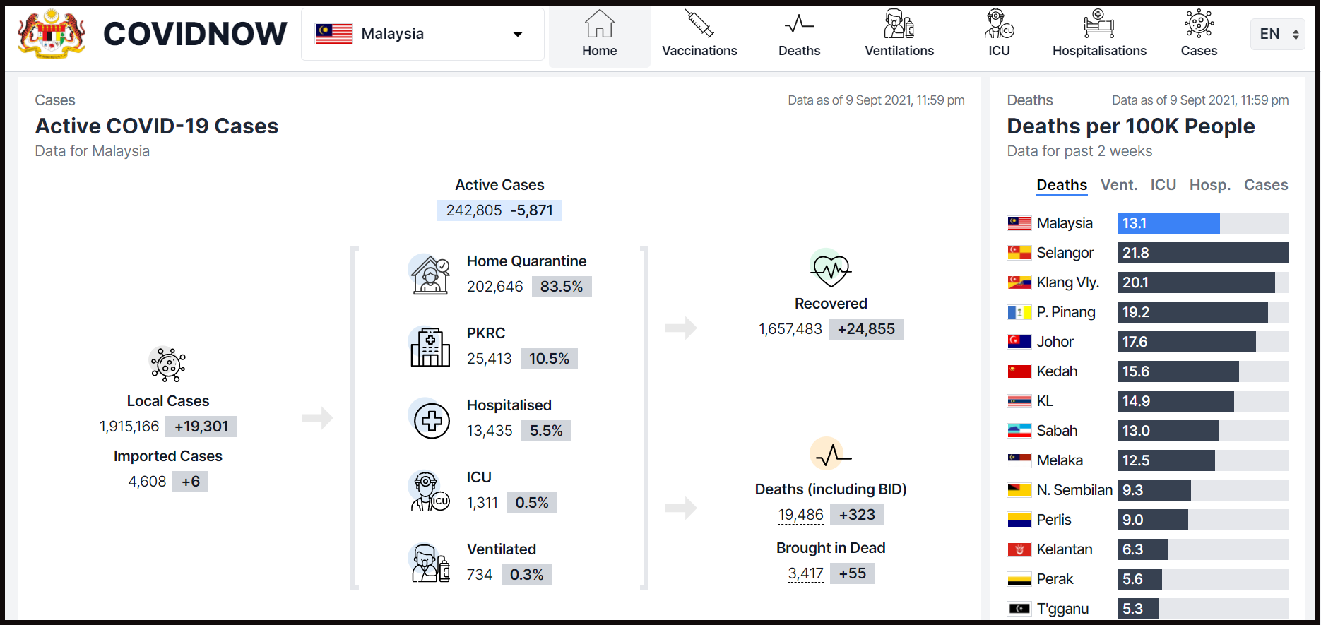
But to paraphrase a wise Mad Titan, there must be balance in all things. Making things easier to understand means sacrificing some details. And sometimes, publishing more data ends up reducing the granularity of the information.
We spoke to Aimrun, a regular dude who decided it would be fun to scrape through the death data from the MOH’s daily reports to identify health conditions which may increase your chances of dying to COVID-19 (read our article here), thinking that he’d be super excited with all this new data being made available. And again, we were wrong. Aimrun got his info by extracting the data from kpkesihatan.com but, after COVIDNOW was launched, that data was gone (and oddly not available on Github):
“It seems each time more data is offered, the data granularity suffers. MOH-GitHub went live on 12-July and 2 days later kpkesihatan.com stopped publishing death breakdowns (age, gender, comorbidities).
COVIDNOW went live on 9-Sep and on the same day kpkesihatan.com stopped publishing case breakdowns by vaccination and severity status. Without these data points, it is impossible for outsiders to predict where this disease is going to go.” – Aimrun, to CILISOS.
So, is it really possible to achieve full data transparency?

So, while it looks like KJ is keeping to his promise of making the data more transparent it also seems that they’re also trying to make it more understandable to the general public. While there are definitely improvements that can be made on both counts, it looks like things are off to a strong 11-day start.
Since there are another 89 days of KPI-ing to go, it would be interesting to see what other changes the MOH makes – in other words, this article will be updated lah.
Meanwhile, we’re gonna publish this before anymore developments pop up.
- 309Shares
- Facebook288
- Twitter4
- LinkedIn4
- Email5
- WhatsApp8


