10 really annoying things about Malaysian malls (and our ingenious solutions)
- 1.6KShares
- Facebook1.6K
- LinkedIn1
- Email1
- WhatsApp2
We all have our pet peeves. Maybe for some of ugaiz, it could be rude drivers… or it could be someone placing toilet paper the wrong way… or it could even be the button in the lift or floor that’s 3A instead of 4 (like seriously, if you’re gonna be afraid of a number, it should be 7 – coz 7, 8 (ate), 9 geddit?) 😛
So when the CILISOS team were out and about, we noticed a coupla pretty strange things about Malaysian buildings that were also annoying as well. They could count as pet peeves for some of you, or maybe not, depending how zen you usually are about these things. Here are 10 annoying things about Malaysian buildings. We won’t name names, but some of these are real photos of actual Malaysian buildings we took ourselves. But it’s all for fun la, so take a chill pill ok, guys.
1. Slow handrails
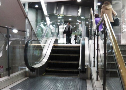
Yep, this is exactly what we mean – escalator handrails that jerk backwards or are not in sync with the stairs. Why is it important to have handrails in sync? What’s the reason for having moving handrails at all? Well, it’s a safety measure, to help riders steady themselves when stepping onto moving stairs. Imagine if accident how? Takkan the building management wants to risk that, even though Malaysia’s not like the United Suing of America when it comes to lawsuits.
Unless your escalator looks like this, then mebbe not as dangerous:
SOLUTION: Call the maintenance guys and get it fixed!
2. Autopay for carpark not in carpark
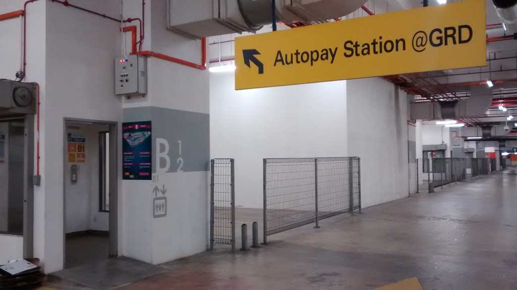
We’ve seen this in a couple of buildings, even our office punya autopay machines are not in the carpark, but on the Ground Floor. So thank goodness for season parking! Seriously, hujan camne? Some buildings are open air summore. But why can’t management just put the autopay machines in the carpark where it’s easier? Security maybe?
Not that this is an awful crime against humanity, but it’s really inconvenient because people generally expect autopay machines to be in the carpark. And for those who’ve gone down to the basement mafan la, gotta go back up again.
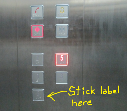
SOLUTION: Put the autopay machines in the carpark and if it’s security you’re worried about, station more security guards around the autopay machines, or at least instruct them to make their rounds there more often. We’ve seen The Curve really step up their security around the autopay machines recently and even saw guards escorting shoppers to their cars, which is good to after the near-kidnapping and robbery incidents.
If you still wanna put them on the Ground Floor, at least put an autopay machine label or sign beside the respective elevator buttons to indicate which floors they’re on. We’ve seen elevators that have indicators.
3. !@#%!# autopay machines themselves
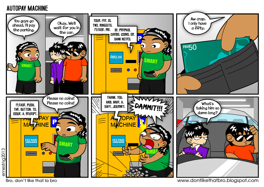
YASSS! We’ve all felt the same pain like this comic creator here. Why do autopay machines always insist on returning change in coins, why?!? If you were in that situation, you’d be left with either begging the person queueing behind you to take pity on you and spot you RM1 or you’d have to go back up and break that RM50. Ask your friends in the car also can lar.
OR HOW ABOUT this lovely practice.
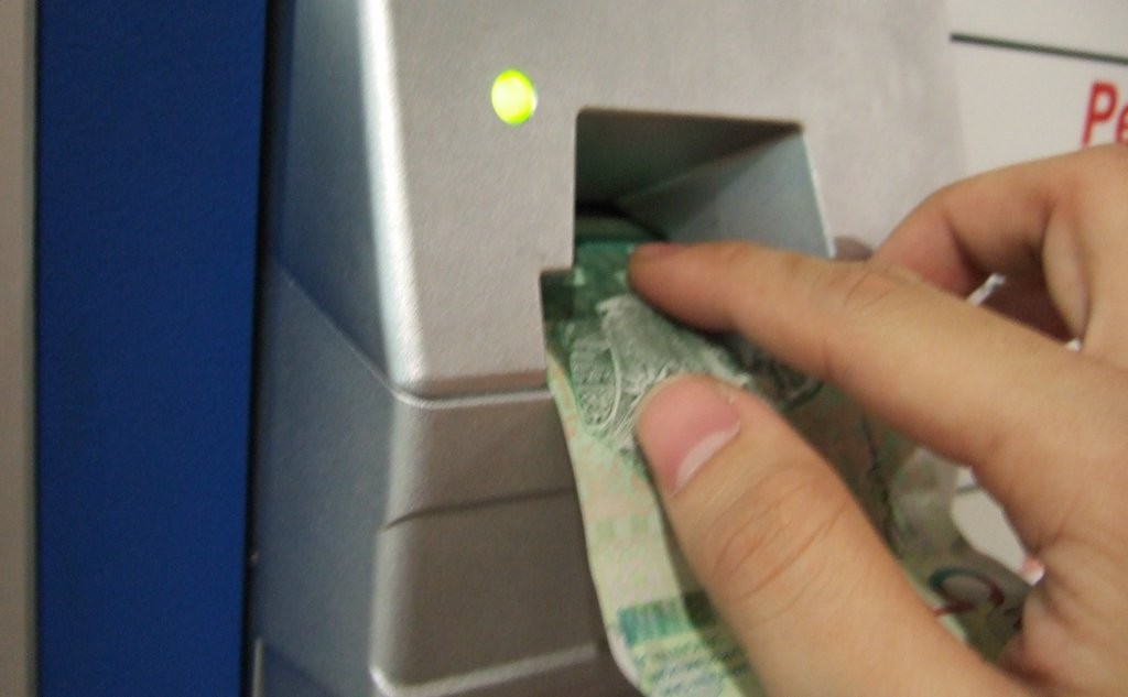
When you need a friggin INSTRUCTION MANUAL on how to insert notes into a machine, you know you got issues.
“….remember to align the notes on the very very left of the slot, else, you’ll probably face trouble paying. Don’t ask why, a bug from the maker of this machine.” – onedusan.com
For some stupid reason, our super smooth shiny RM notes kenot be accepted by Autopay machines. OMG.
SOLUTION: All autopay machines are wired to return our change in notes! C’mon la, we can be the first country in the world to have electronic passports, but autopay systems cannot be fixed? Impossibru. At the very least, fix the machine so that it’ll accept coins la. We’ve visited some buildings where their autopay machines don’t accept coins, not even old coins.
Oh and if you have to FORCE them to accept notes, here’s the CILISOS method™ k?
- Use old notes if you have them. Seriously. They will all work. Even with minor tears
- If you really don’t have any, then scrunge up your note like toilet paper, unscrunge… then reinsert with creases (but still straight ya).
4. Escalators that go in opposite directions
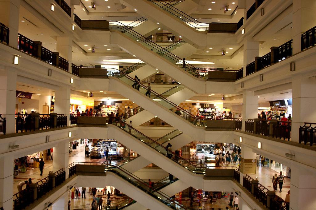
At first sight, it looks like a confusing pattern, like some kind of cross-stitching disaster. But this kind of escalator layout (which we found out is called the crisscross escalator) is also kinda mafan. If you accidentally step on and wanna go back to the same floor, the opposite direction is not beside you but you gotta run one whole circle to the opposite side.
On the bright side, crisscross escalators have only a short moment of awkwardly facing another shopper riding in the opposite direction. Whereas if you ride parallel escalators on a particular side, you’re gonna face strangers awkwardly all the way up/down.
Interesting fact tho, comedian Trevor Noah joked that in Zambia (at the time that he was there), there were only 5 public escalators. He said the first one was built only in Aug 2013 and that people actually queued up in the mall to ride ’em. LOL! But a lot of people commented that he’s wrong, that Zambia had escalators back in the 70s.
SOLUTION: We researched escalator layouts and found out crisscross escalators are the best for minimizing space by ‘stacking’ escalators going in one direction. They’re the most common designs in malls (other escalator designs here). Changing the escalator layout in a building isn’t gonna be a cheap affair and since it is the best for space-saving, we should all just… close our eyes when we use it? No don’t. That’s dangerous!
5. Parking teasers
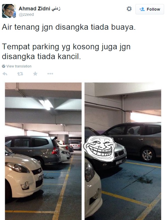
Not exactly an annoying building feature, but we’ve had that exhilaration of seeing an empty parking spot downspiral into disappointment when we see a Kancil or Kelisa (sometimes motorcycle oso, the jerks!) parked there. Aiyo, potong stim. If this alone is not frustrating enough, the car behind you cuts in front then finds a legit parking space….ARGHHH! There’s one way this can be solved and we’re not talking about having security guards guide each car to a vacant spot:
SOLUTION: Simple. Install parking light indicators. This one:
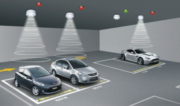
Many malls in Malaysia already have them. Other buildings prolly not so much. But wouldn’t it be nice if every building had these? Especially your office? Then you’ll never be 5 minutes late ever again. 😛 But we found a case where a light indicator COULDN’T detect a Kancil and this guy posted it on Lowyat Forum.
6. Disturbing kiddy rides
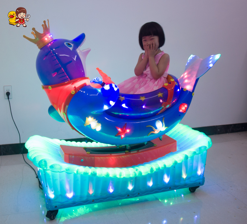
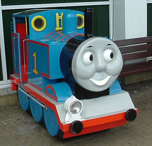
This is not really annoying, but more on the creepy side. Have you ever noticed how dodgy-looking some kiddy rides can be in shopping malls? Especially those designed with a face and creepy smile. Eee gelinya, why don’t people think twice before buying a kiddy ride like that?
Who designed these things?
SOLUTION: Erm…how about installing kiddy rides that don’t have FACES and creepy smiles. Like a car, or a plane, or a train. Not Thomas the Train. Coz Thomas is pretty creepy.
7. Touch screen directories that never work

When malls finally installed touch screen directories with the search function, we thought our days of wasting time skimming through old skool directories were over. But then at some places, their touch screen directories don’t function properly. When we try to select something, it doesn’t detect. You really gotta press like you’re going to war with the screen. If our butts can accidentally dial a number on our phones, why can’t touch screen directories be more sensitive too? The screens might be different, but then not all malls have this problem.
SOLUTION: Make the touch screens actually sensitive. Do some maintenance work on it once in a while la.
8. Keluar signs everywhere…

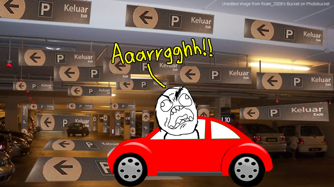
…that lead you round and round before you finally get to the exit! Ok, we know the picture above is super exaggerated, but it was kinda difficult for us to get so many signs into one shot.
We dunno why some buildings like to play hide n’ seek with their exits. We know they wanna keep their customers to staying as long as possible, but c’mon man! You know which mall has a really straightforward exit tho? Berjaya Times Square. It’s one direction to masuk which is up, and one direction to keluar, which is down. No headaches.
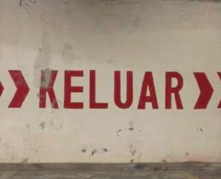
SOLUTION: Well, we’re no architecture experts. Could be people place keluar signs in every row to ease congestion, so that all the cars won’t drive along the same row and cause traffic jam. However it would be nice if we could know where we’re going. It might help if they painted a big >>>KELUAR>>> sign along a stretch of wall towards the exit. Then at least we don’t have to turn here, turn there. Something like this:
9. Stairwells that smell WORSE than toilets
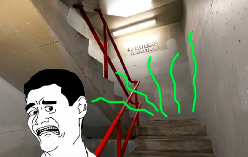
That’s because some stairwells ARE toilets, haha. Have you ever noticed that most stairwells tend to be the dirtiest part of every Malaysian building? It’s prolly coz some people do their business there. You’ve seen puddles on the floors on stairwells, admit it. Then sometimes the handrails are sticky, UGH! For all the money management spends on keeping their toilets and car parks clean, why not ask the cleaners to look after the stairwells too?
SOLUTION: This is just a hunch, but it’s a psychology thing – if you keep stairwells clean, the public will appreciate it and will wanna keep it clean too. Dutch researchers did a study where they split people into 2 groups. 1 they put in a room that smelled citrusy and another they put in an unscented room. Then they gave everybody very crumbly cookies. The group in the citrus-scented room actually bothered to clean up the crumbs, while the other group didn’t really care.
Otherwise do what Singapore did – customers complained that someone had been peeing at the Fajar Shopping Centre stairwell. So they sent a security guard to take care of the fler. Unfortunately this case didn’t end well for the poor security guard. Read the story here.
10. Floor names that don’t make sense
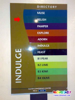
Anyone know where this is ;)? Muse. Relish. Pamper. We don’t even know which level we’re on when we’re there. What happened to good old fashioned Ground, First and Second Floor? Actually there’s a reason why each of the 7 floors is named a certain way. Each floor follows a particular concept so regular customers especially will relate to it that way. It’s like themed la.
But who’s gonna actually remember the floor names unless they’re like regulars? Good thing label the floor names on their lifts, but if you use the escalator, you gonna be like, “Did I just get off on the Adorn Floor? Or the Indulge Floor?” and “How many times to I have to go up before I reach the Muse Floor?”
Don’t even get us started on Publika’s lifts.
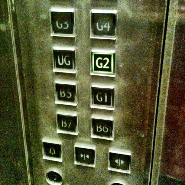
Yep, it jumps from B5 to G1, but that’s not the same as LG cos there’s a UG between G1 and G2. Even Einstein wouldn’t remember where he parked.
SOLUTION: Normal names maybe? Like B1, G, 1, 2? It’s not that hard for people to get y’know. Customers will pick it up in a snap, since every other building in Malaysia is normally like that. Dowan also at least add ‘G’, ‘L1’, ‘L2’ beside each fancy name, right? Eg. G Feast, L1 Indulge, L2 Adorn.
In Publika’s case? Wah this one quite hard. Er… maybe don’t hire a mental patient to do your floor naming.
So which one is the most annoying to you?
We had a few more things in mind, like:
- Half-floor car parks (eg. B1, B1A, B2, B2A, etc.)
- Confusing toilet signs mistaken for elevator signs.
- CCTV warnings which lull you into a false sense of security, but when you look around, you can’t find a single CCTV camera.
So which one of the 10 annoying things do you find most annoying? Add your own in the comments section if they’re not in the poll. 🙂
But out of all these annoying things, some of them need immediate fixing for safety’s sake la. Yes, the slow escalator handrails definitely. Previously we’ve written articles about buildings also (here and here), but those were very sad and tragic incidents. A lot worse than being annoyed at the autopay machine not being in the carpark. If they could fix the others too, everyone will have such a funner, less mafan time going to these places.
Hopefully one day, some Malaysian will invent a genius Keluar sign solution. No more horrendous driving round and round to exit. YAY!!
- 1.6KShares
- Facebook1.6K
- LinkedIn1
- Email1
- WhatsApp2


