5 popular brand logos in Malaysia with hidden easter eggs you won’t be able to unsee.

- 162Shares
- Facebook101
- Twitter9
- LinkedIn11
- Email18
- WhatsApp23
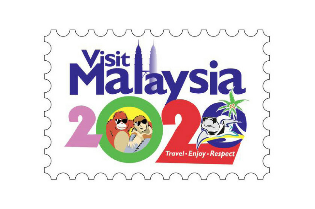
If there’s one thing that we’ve learned from Libresse’s “Know your V” campaign, is that Malaysians care a whole lot about visuals. In fact, us Malaysians care so much about visuals that last year, our Tourism and Culture Ministry got seriously flamed online for their “Visit Malaysia 2020” logo, which people were quick to call… ugly.
Local government branding aside, there’s also been moments where us Malaysians see other kinds of brand logos and ponder about what exactly that… er… abstract shape is supposed to represent. But did you know that there are actually hidden meanings and secrets behind some of the brand logos that we see each and every single day?
FYI: This article is NOT sponsored. But if any of them would like to sponsor us, I mean… Our doors are very much open. *wink wink nudge nudge*
1. Dettol’s logo is ACTUALLY a sword and shield.
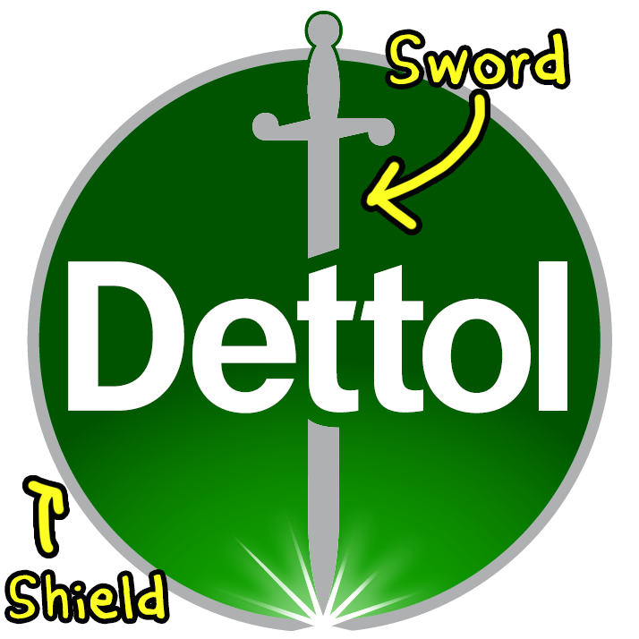
Ahh.. Dettol. If there’s one thing that we’ve been clinging on to since the strikening of Kobid19, it’s these bad boys.
There’s been some speculation about the long thingy that’s piercing through the “Dettol” wording, with several people guessing it’s a crucifix, or a cross symbol. But if there’s anything we’ve learned from our friend Ernest’s depiction of the logo, the lengthy object in the middle is actually a sword. Why? Because it’s used to symbolize that it kills germs, or in Dettol’s case, 99.9% of them.

Oh! And the green circle in the middle? It’s not just there as a backdrop. It’s actually a shield. If you’re a medieval fantasy geek, you’ll probably know that swords and shields mean protection, and that’s because Dettol’s supposed to protecc you against those harmful bacterium.
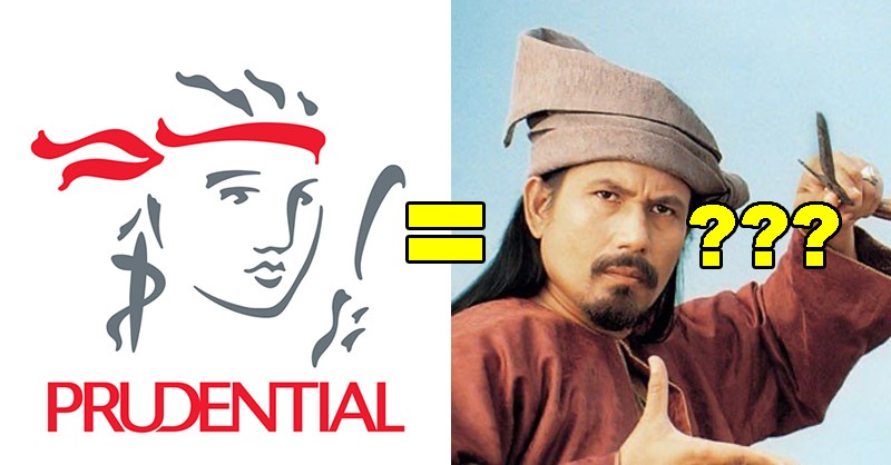
2. Prudential’s logo isn’t a fisherman, but a… mythological woman ?
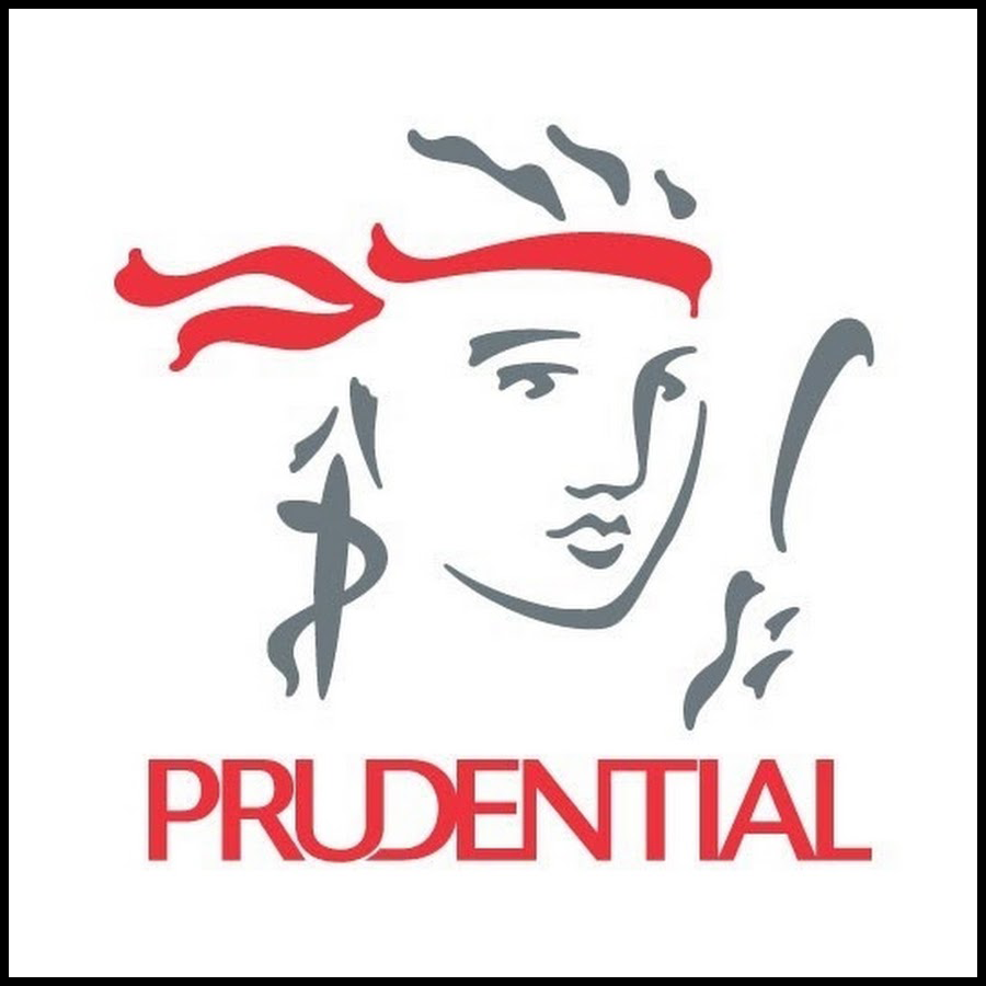
There are many interpretations of the Prudential logo. Or at least, among those of us in the CILISOS office.
Some think that it’s a fisherman holding a fishing rod, some others think it resembles Lady Liberty, from the Statue of Liberty in New York. However, we found out from someone within the company that the logo actually represents Prudence, A.K.A. Prudentia in Latin.
Prudence is often depicted as a woman holding a mirror and a staff with a serpent wrapped around it, which is basically the basis of the logo. There are a quite a few variations of Prudence, where she might be holding the serpent directly or looking away from the mirror, but the elements are always present. We don’t know why a mirror and snake, but it’s most likely because of ✨mythology✨ reasons.
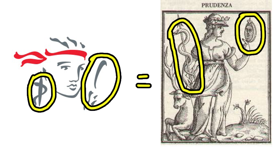
And here’s another fun fact: Prudence, as some of y’all might recognize, is the cardinal virtue for being wise and making good judgements. Which kinda makes sense cause it’s being used as the logo for an insurance company.
3. Public Bank’s logo is actually… an eye?!
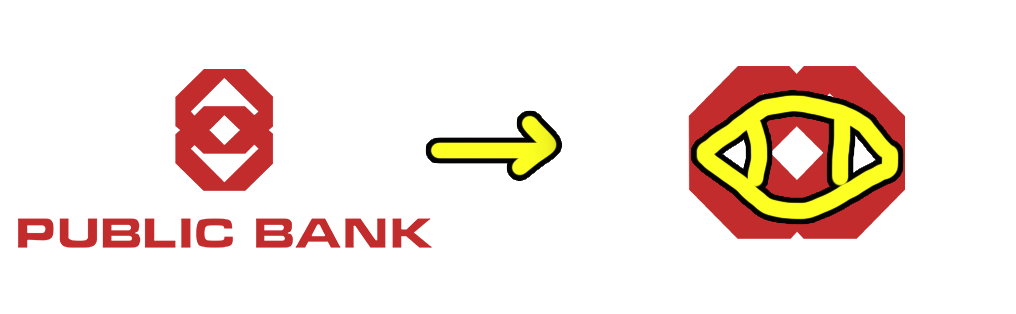
“It’s an 8!”
“It’s a clown!”
Nope. Put your conspiracy theory hats away, because it’s actually as direct as it seems. The logo is literally meant to be two octagons interlocking. According to their website, the shapes are supposed to denote their “domestic and international connections” that shows their strength and stability.
However, the logo is also made to form an “Eye of Foresight”. The “eye of foresight” means they’re able to look ahead into the future, which is great symbolism… for an entity that’s supposed to manage your money.

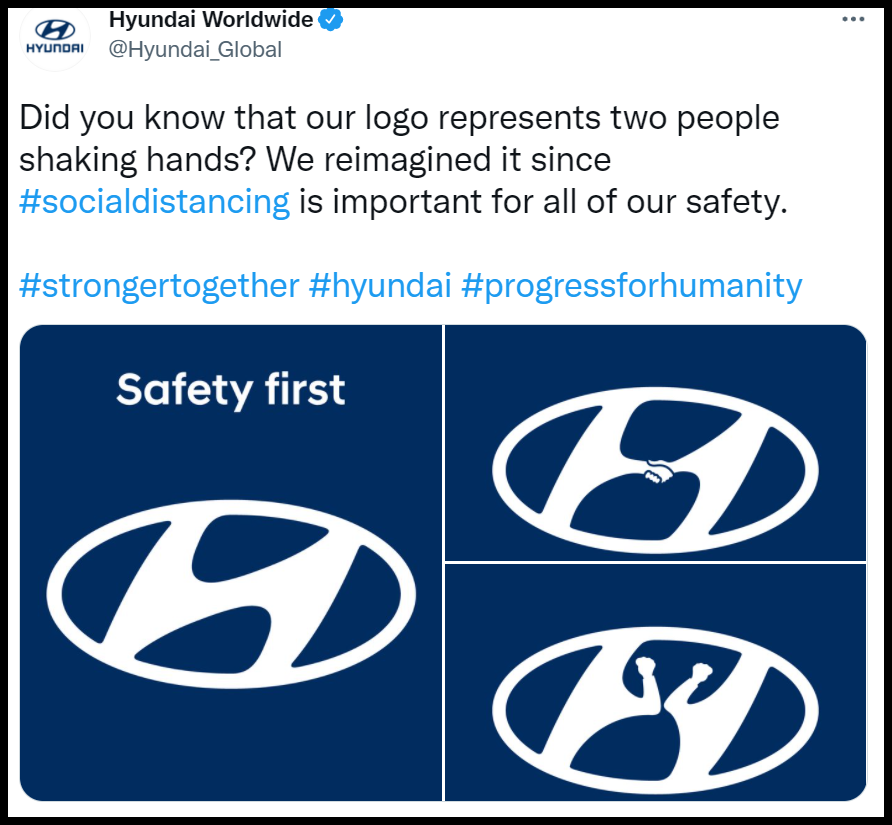
4. Hyundai’s logo isn’t just a fancy ‘H’. It’s two people shaking hands.
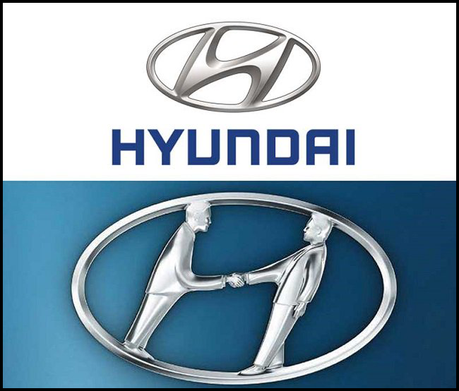
Besides looking like a very fancy ‘H’, the Hyundai logo is actually two people shaking hands. One of the “people” is supposed to represent a Hyundai employee, while the other is a very happy customer who’s just bought one of their cars. And they’re sealing the deal with a very firm and solid handshake.
But ever since being in this whole virus situation, Hyundai has sorta jumped onto the bandwagon by tweeting this image as part of the whole “social distancing” shtick, which we’ve gotta say is pretty darn good marketing…
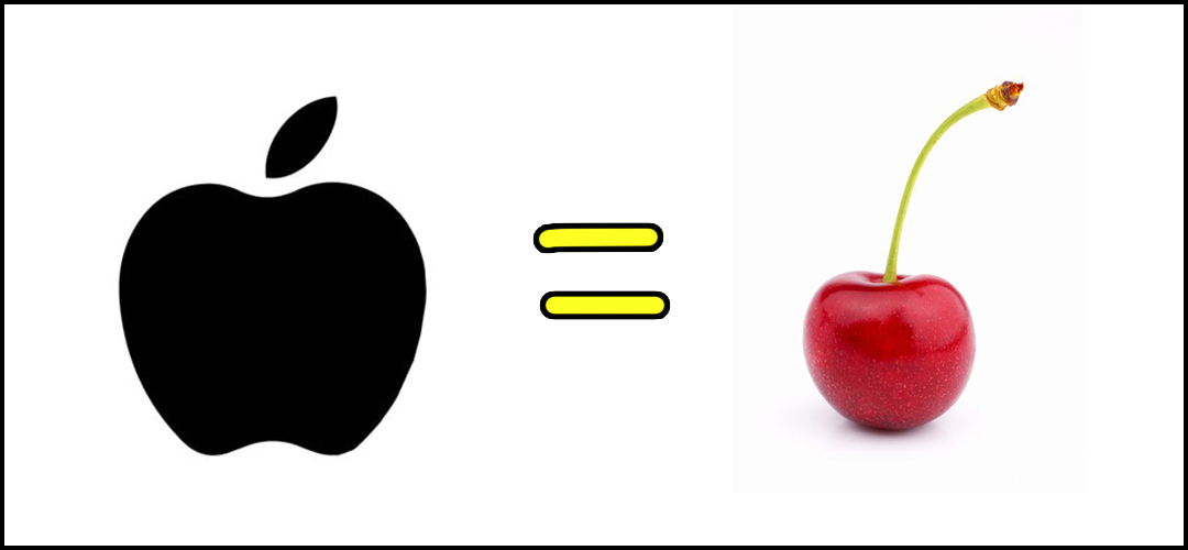
5. The iconic Apple ‘bite’ exists because people thought it was a CHERRY.
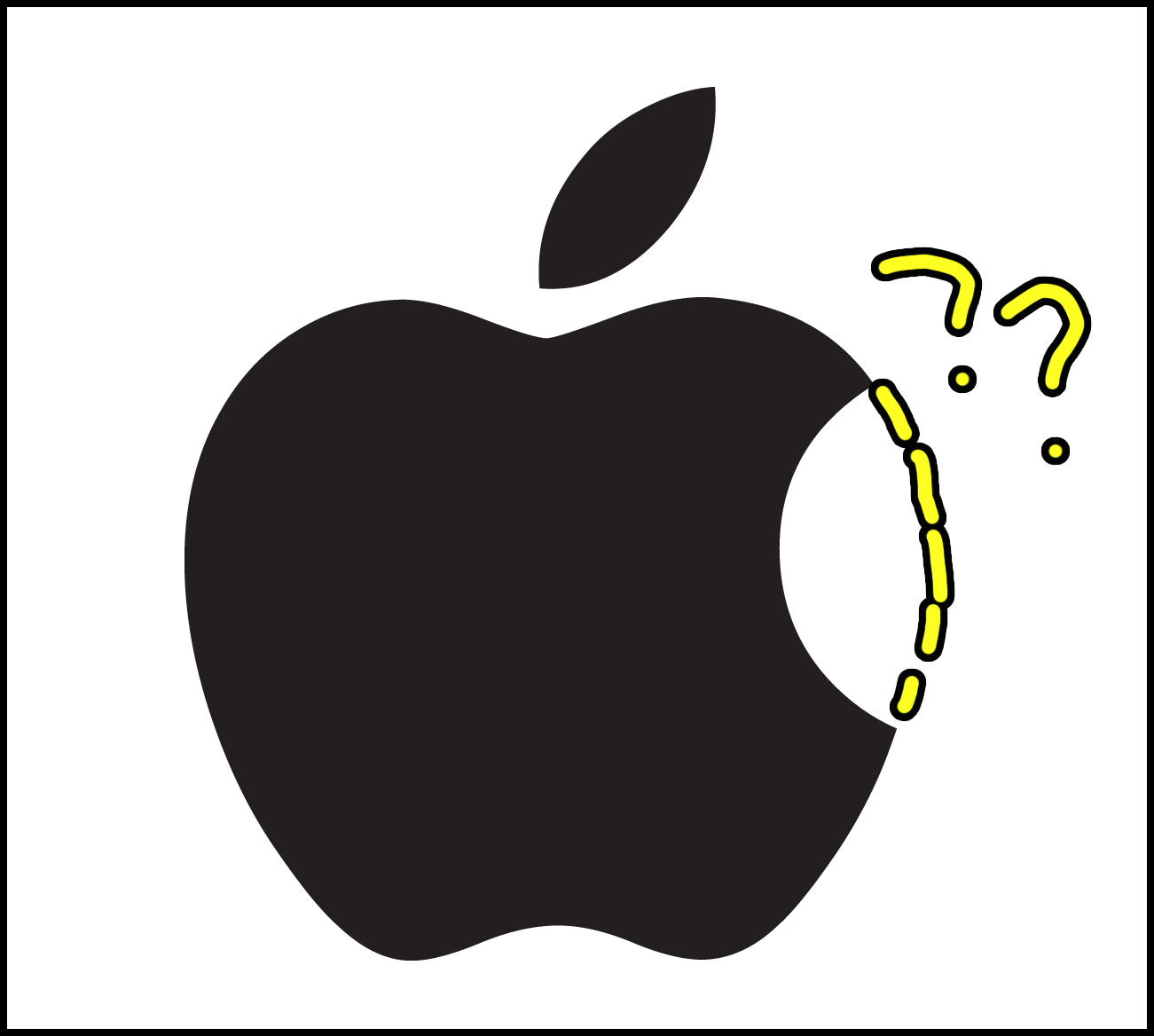
Design majors might already know the history behind the iconic ‘bite’ in Apple’s logo, but the story behind the ideas that went into this major design decision stretches far beyond aesthetic reasons. There’s been many theories made about why the apple in Apple’s logo has a ‘bite’ taken out of it; with references to Snow White & the Poison Apple, or Adam & Eve in the Bible.
But according to the guy who designed it? It was because they didn’t want people mistaking the smaller version of the Apple logo for a cherry. And we can kiiiinda see why…
Bonus info: The ‘bite’ in the Apple logo is also used to represent “bytes”. #lametechjoke
Sometimes you see it, and sometimes you don’t.
If there’s anything we know about brand logos, is that they’re everywhere. Each one with their own little details which usually have some form of “message” that’s meant to reach us, the consumers, to give us some form of impression. And while that’s a great idea, the truth is… Most of it goes unnoticed. 😩
Strangely though, there’s also been moments where we read a little bit too much into certain logos or images, and come up with.. uhm.. interesting conclusions, which goes to show that if you look at a brand logo for long enough, you might just find something hidden within, albeit intentional or not.
So, whether some of these “easter eggs” were truly “hidden” or just not as obvious enough for us to notice, one thing’s for sure: There’s definitely more to these brands than meets the eye.

- 162Shares
- Facebook101
- Twitter9
- LinkedIn11
- Email18
- WhatsApp23